We are SIRKA – a full-cycle DTC agency
created and launchedthe Arq8 Creatine brand


Market Size & Forecast: creatine goes mainstream
By 2025, creatine moved beyond gyms into explosive scaling driven by mainstream wellness, online sales, and a broader audience.
Growth forecast: from $1.37B in 2025 to $8.68B by 2033 with a 26.2% CAGR — a rare metric even for the supplement industry.
North America leads with 40.8% of the market, driven by a strong DTC segment, mature fitness culture, and a longevity focus.
The market is highly competitive. Key players operating here include:
- Global brands (Optimum Nutrition, MuscleTech) lead via omnichannel distribution, massive budgets, and line extensions (RTD, gaming) targeting endurance and cognitive function.
- Tech giants (AlzChem with Creapure) supply ultra-pure raw materials and leverage ingredient marketing to boost the value of end products.
- DTC brands (Create, Omni) focus on convenient formats, vegan alternatives, and building loyal, content-driven communities.
The Task
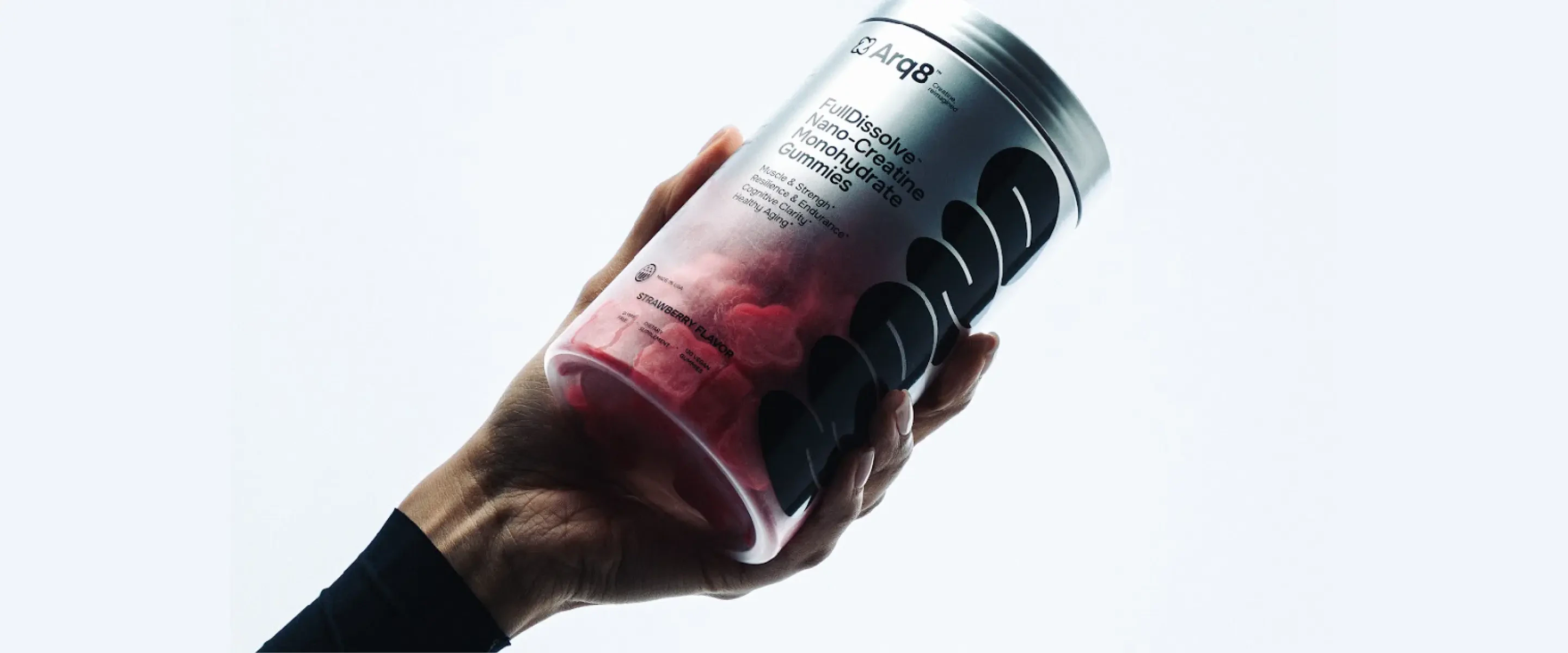
Develop and launch a DTC creatine brand for the North American mass market. The target audience spans athletes and fitness enthusiasts (the core), active women, the 35–50 wellness and anti-aging demographic, and the 50+ active longevity segment.
The Challenge
Stand out in an oversaturated, fierce market by building a brand and visual system that resonates with a broad, diverse audience—without losing focus, trust, or expertise.
Research
Competitive analysis: branding, positioning, sales funnels.
Analyzed over 60 US market competitors with robust performance marketing. The research focused on positioning, branding, packaging, offers, sales funnels, and creative approaches.
Studied 8 key creatine consumer cohorts. Based on growth potential and brand strategy alignment, 4 priority audiences were selected for the initial product launch phase.
Key Research Insights
Branding
Brand positioning
Next-gen creatine for daily performance — featuring enhanced absorption, a convenient format, and a focus on consistency rather than one-off workouts. Not just sports, but energy, focus, and long-term body and brain health.
This positioning unlocks diverse use cases — from sports and active lifestyles to cognitive support and longevity. The product transforms from sports nutrition into an essential nutraceutical for daily quality of life.
Next-gen creatine for daily performance — featuring enhanced absorption, a convenient format, and a focus on consistency rather than one-off workouts. Not just sports, but energy, focus, and long-term body and brain health.
To deliberately define the brand's position and shape the right perception, we used perceptual mapping.
The map plotted not only key creatine competitors but also top supplement DTC brands with strong positioning and distinct brand identity.
This positioning unlocks diverse use cases — from sports and active lifestyles to cognitive support and longevity. The product transforms from sports nutrition into an essential nutraceutical for daily quality of life.
We worked with two pairs of axes: — minimalism ↔ vibrance and mass-market ↔ premium look; — masculine ↔ feminine look and scientific ↔ lifestyle.
The selected sectors served as a benchmark and set the framework for all subsequent design decisions.
To deliberately define the brand's position and shape the right perception, we used perceptual mapping.
The map plotted not only key creatine competitors but also top supplement DTC brands with strong positioning and distinct brand identity.
We worked with two pairs of axes: — minimalism ↔ vibrance and mass-market ↔ premium look; — masculine ↔ feminine look and scientific ↔ lifestyle.
The selected sectors served as a benchmark and set the framework for all subsequent design decisions.
Naming
ARQ8 — the name references the word Arcade as a metaphor for an endless, engaging game where consistent movement and personal progress matter. The number 8 symbolizes an infinite energy cycle. The name sounds short and tech-driven, letting the brand speak of physical strength and mental endurance.
Concept development
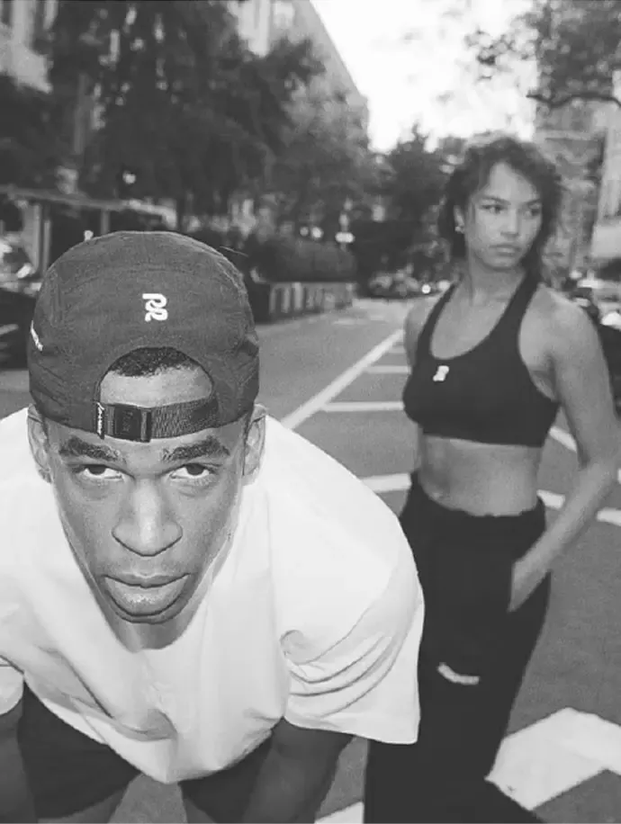
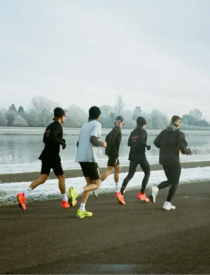
Inspiration comes from street sports and movement beyond the gym. Real bodies, sweat, asphalt, city life, and functional gear instead of sterile fitness gloss or sweaty bodybuilder clubs.
The style is bold, modern, and vibrant. It’s about intensity, freedom, and constant motion — where a workout starts outside the gym and never ends with the last set.
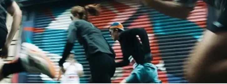
The style is bold, modern, and vibrant. It’s about intensity, freedom, and constant motion — where a workout starts outside the gym and never ends with the last set.
Plump bubble letters are a direct nod to 80s-90s graffiti culture, a symbol of street energy and self-expression. This visual code communicates constant motion: creatine as fuel for those who create and never stand still. Meanwhile, soft, rounded shapes strip away traditional sports nutrition's toxic masculinity, shifting the product into wellness territory — creatine for all, not just bodybuilders.

This typography stands out digitally, creating a potent visual identity and acting as a brand manifesto that bridges street culture with a new philosophy of energy completely free from aggression.
Brand book and web design guidelines
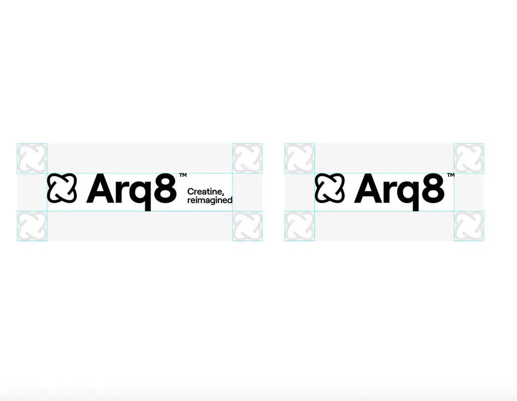
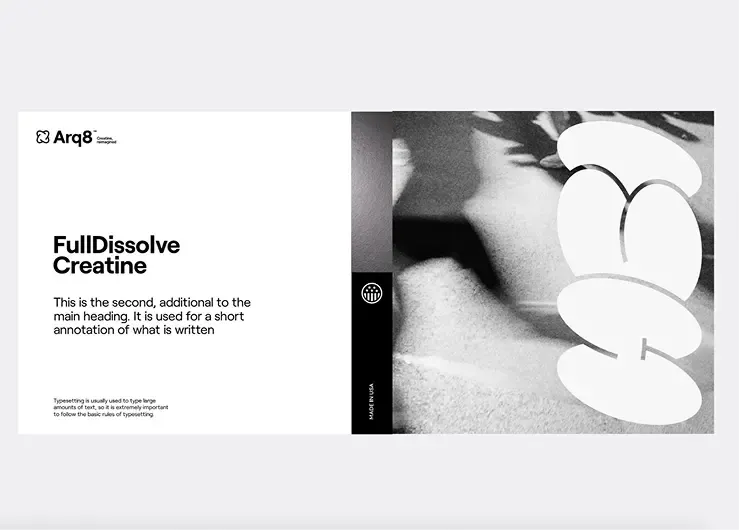
We opted for a strict, tech-focused identity and uncompromising minimalism. The typography is built on the Onest typeface, rigidly locking in the hierarchy from large headings to technical copy.
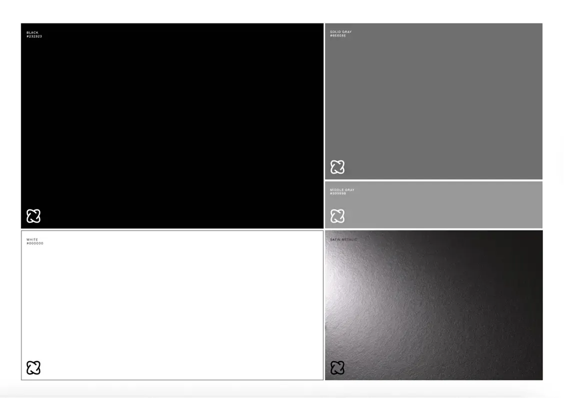
The color palette is narrowed down to a contrasting achromat. This lack of color combined with vast open space creates a premium image of a futuristic wellness product.
Packaging
Packaging design for 15 SKUs across multiple formats
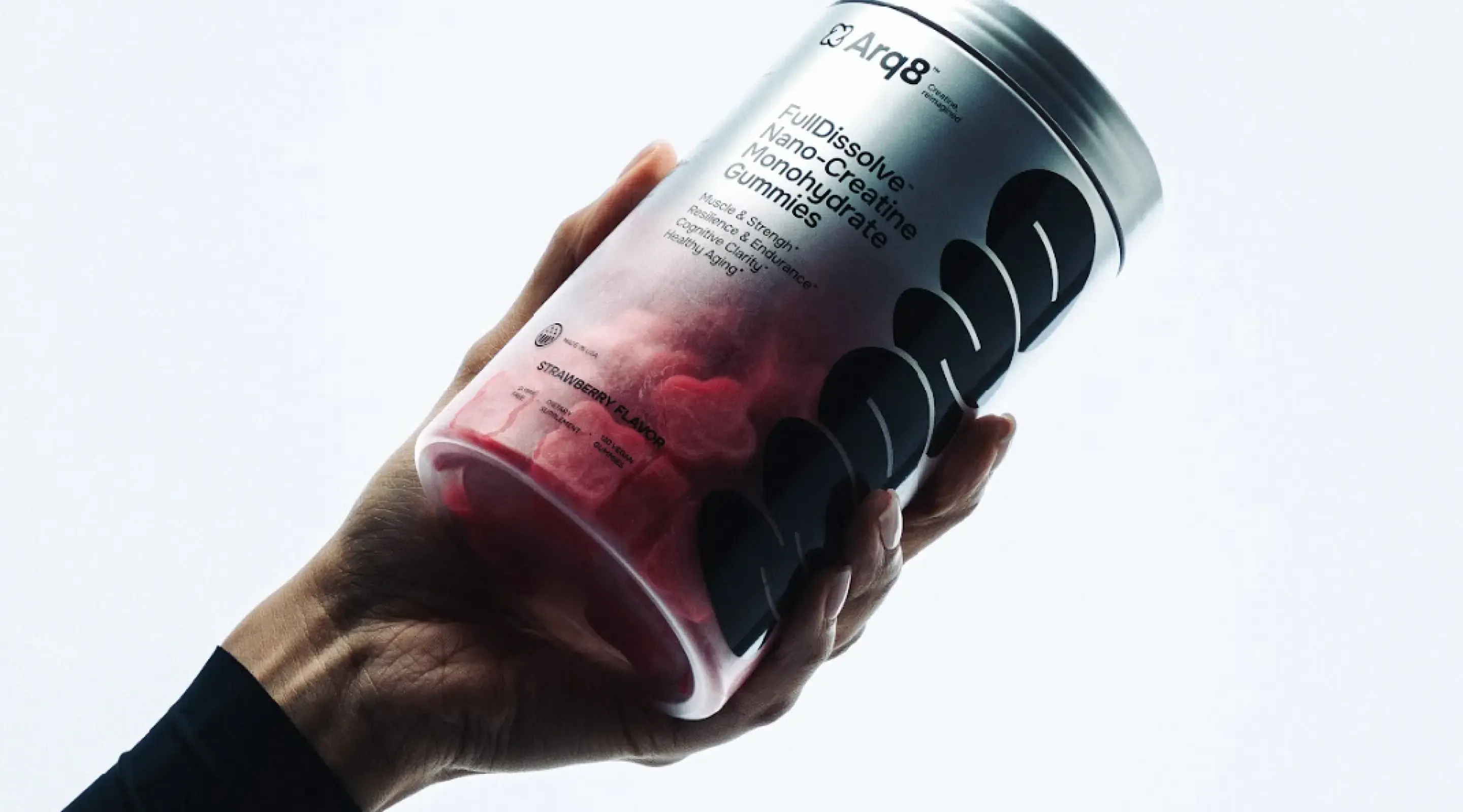
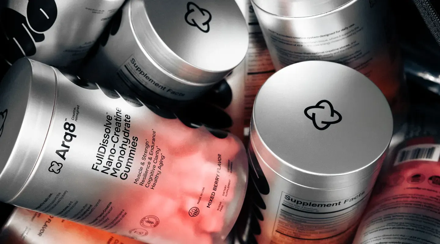
The brand offers creatine in top formats: powder and gummies. We designed jars and refill pouches for them, bringing the minimalist identity onto packaging.
A laconic design with clear variables easily scales across all 15 SKUs, separating flavors and formats. Well-thought dimensions optimize production and logistics costs.
Gummies
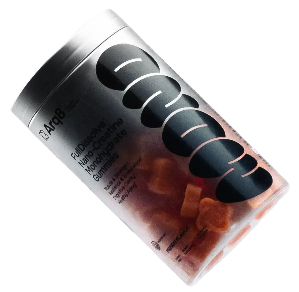
The custom gummy shape mirrors the logo atom. The jar features a clear, frosted window portion, which beautifully showcases the product and lets users see how much is left inside.
Powder
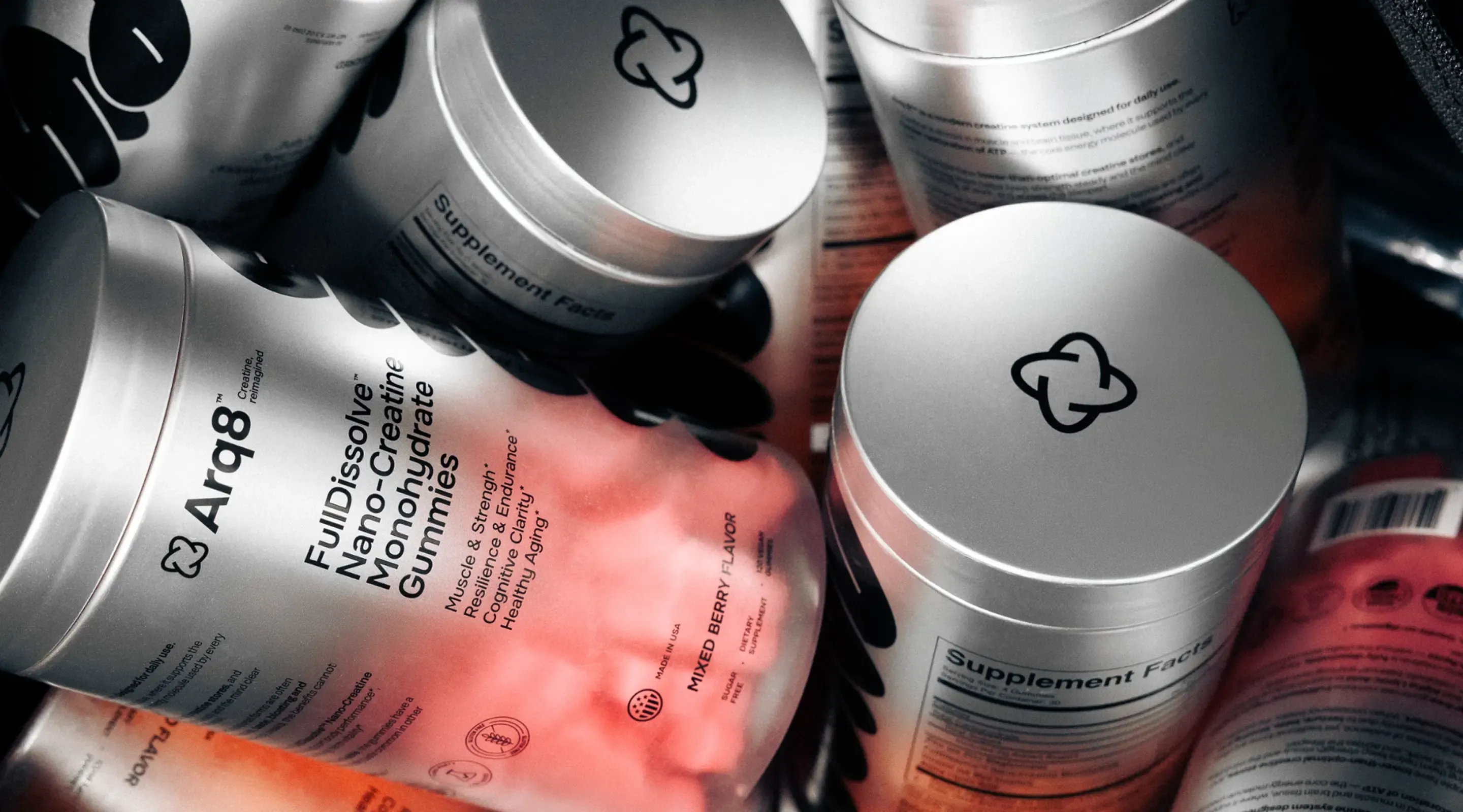
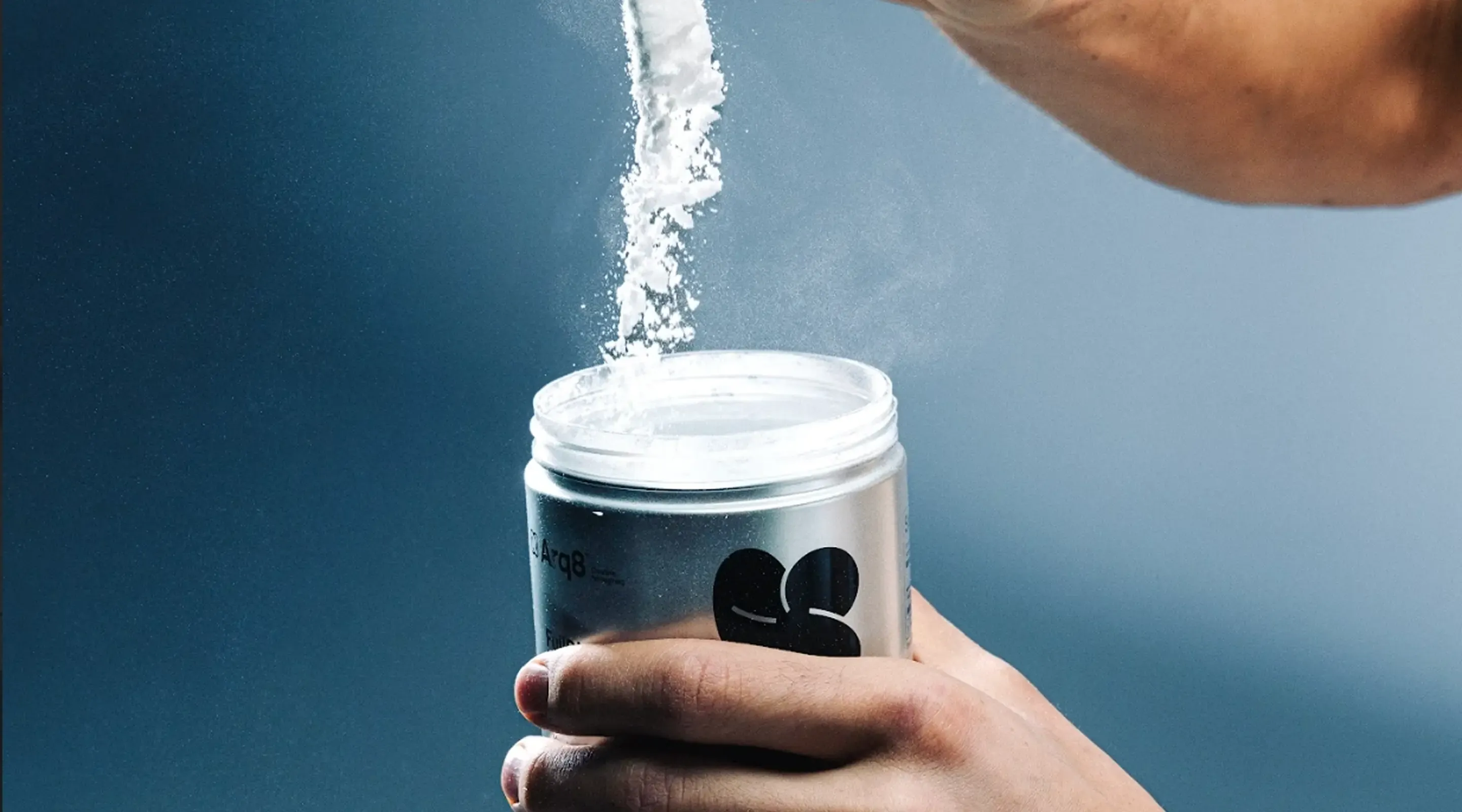
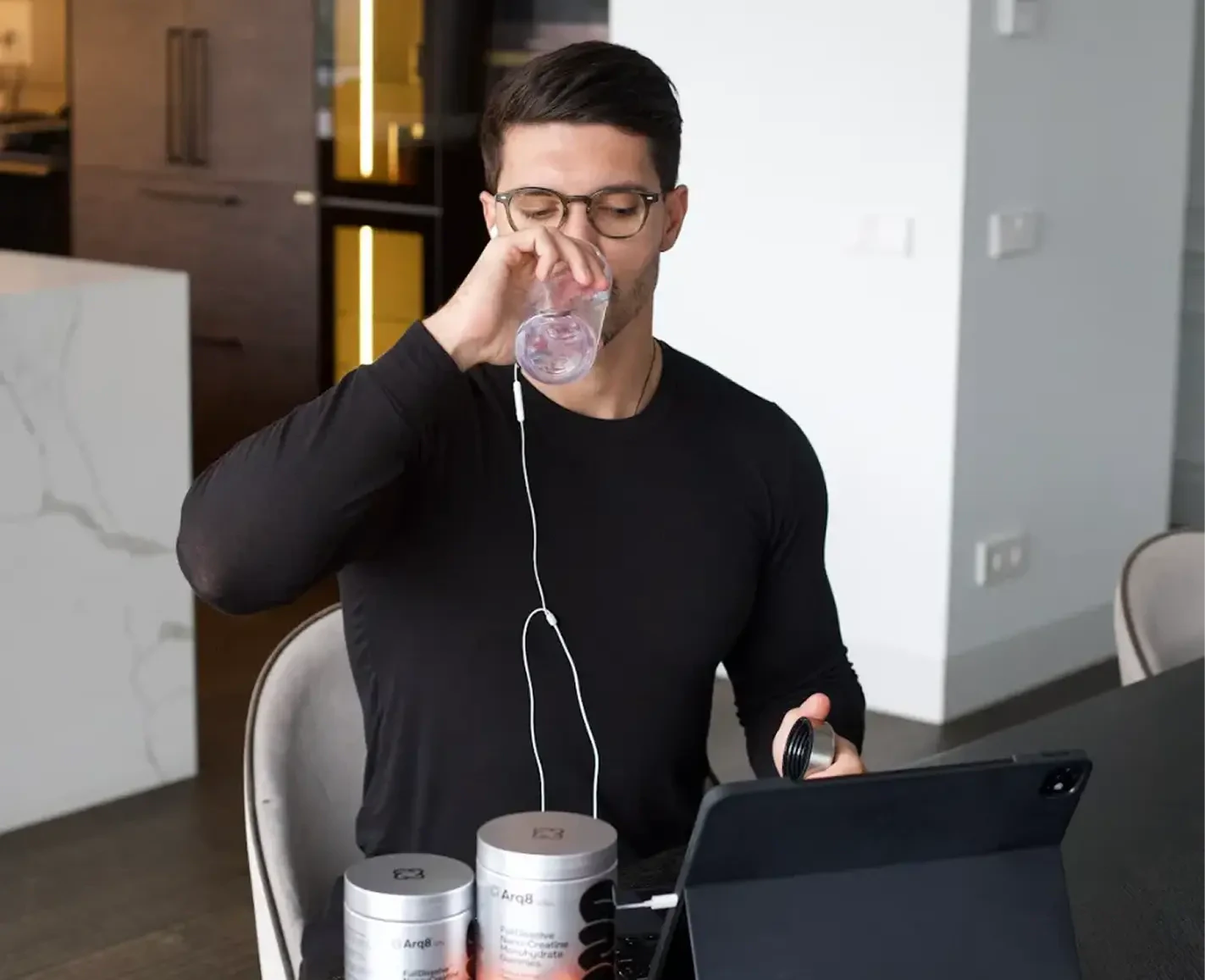
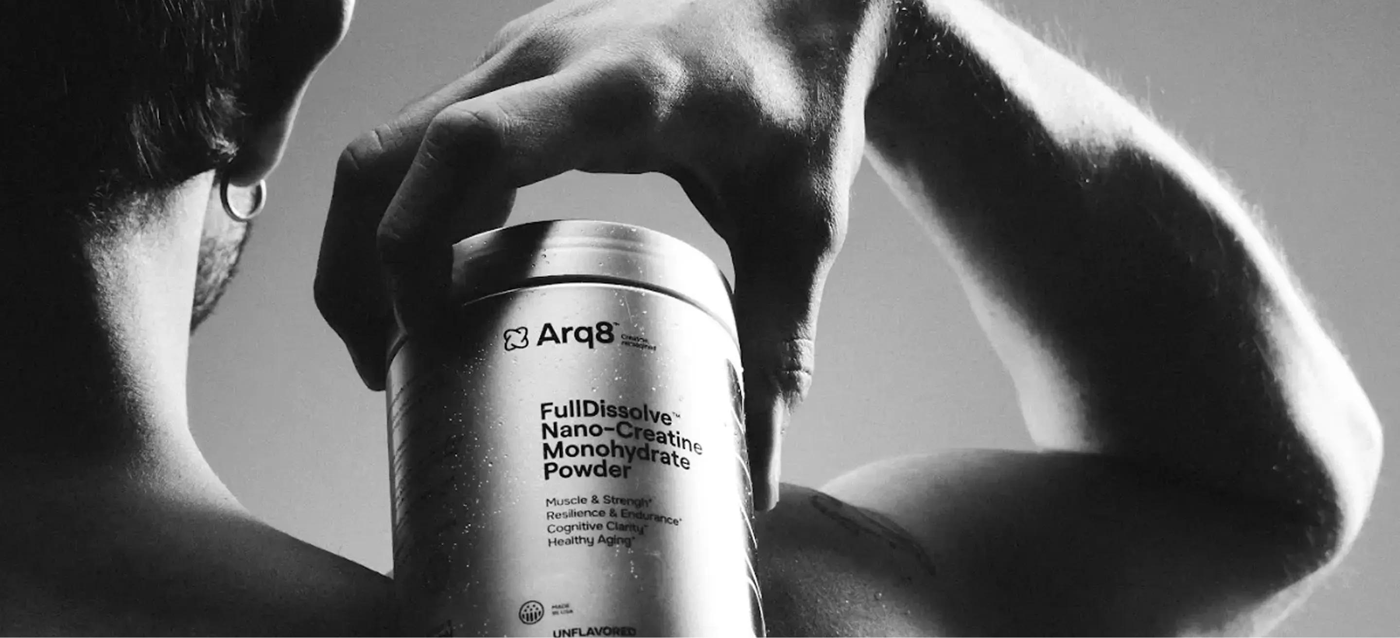
The chrome-toned jar is crafted with a wide mouth for easy access with the measuring scoop that comes included in the set.
Refill pouches
In pouches, the chrome theme was adapted into soft formats: a 5-day trial, and 30- and 90-day refills. The format solves storage and repeat purchase issues while lowering plastic waste output.
NRG STRIPS
Packaging was also designed for complementary supplements: vitamin B6 strips, electrolytes in a tube, and magnesium for post-workout recovery.
Welcome box
To build a strong first impression (and drive high LTV), we designed welcome boxes with products and merch. Frosted plastic on the box continues the jars' theme.
Strong branding is not just about looks, but about working unit economics. Stellar visuals elevate product value in the customer’s eyes, justifying a higher price. In the end, design backs up metrics, entering the financial model.
Web
01.
E-commerce strategy
02.
Website wireframes
03.
Digital design system
04.
Full-stack development
05.
Copywriting
06.
Shopify store setup
07.
QA and stress testing
Creative
01.
Creative research and analysis
02.
Static and motion advertising
03.
Video editing
Client review
The team dove deep into the market, helping build the brand visually and strategically. They managed the project systematically with sharp attention to detail, from positioning to launch. As a result, we got a clear, scalable brand with a solid foundation for growth.
Takeaways
How to stand out from competitors
Differentiation in an overheated category comes from precise positioning, not loud promises. Driven by perceptual mapping and cultural context, the brand claims an open slot between aggressive sports nutrition and bland wellness.
Packaging as performance creative
Packaging is the initial performance creative. The jar's design acts as an eye-catcher, boosting CTR and lowering CAC before the landing page. Crisp visuals also clear the way to stand out on Amazon and future offline retail shelves.
Branding as a DTC economy driver
Strong branding directly drives DTC economics: it creates a high perceived value, keeps a premium price point, and attracts an audience ready to buy on a regular basis instead of just once. This boosts LTV, expands allowable CAC, and makes paid media scaling stable and predictable. As a result, branding stops being just an ordinary visual layer and becomes the core foundation for growth and the overall financial model of the brand.
Sirka services within the project
Sirka team members shaped the project
Brand Lead

Marketing Lead

Art Direction

Marketing Research

Marketing Research