We are SIRKA – a full-cycle DTC agency

FYRA
Metabolism Supplement Branding & Packaging
Overview
SIRKA developed the naming, positioning, visual identity, and packaging for FYRA, a new DTC metabolism supplement entering the US weight-management market. FYRA is made for Americans who want appetite control without needles, stimulants, or a three-digit monthly bill: a natural answer to the GLP-1 wave.
Brand Concept
The weight-loss shelf is split between two clichés: neon fat burners that scream “burn” and interchangeable pastel wellness pouches. FYRA takes a third position, built on warmth and control instead of aggression and guilt.
The name means “fire” in Swedish: a steady inner flame, not a spike and a crash. The brand’s signature element is the proprietary CarbBind™ Complex. It runs through the pack, the ads, and the brand story.
Package Design & Art Direction
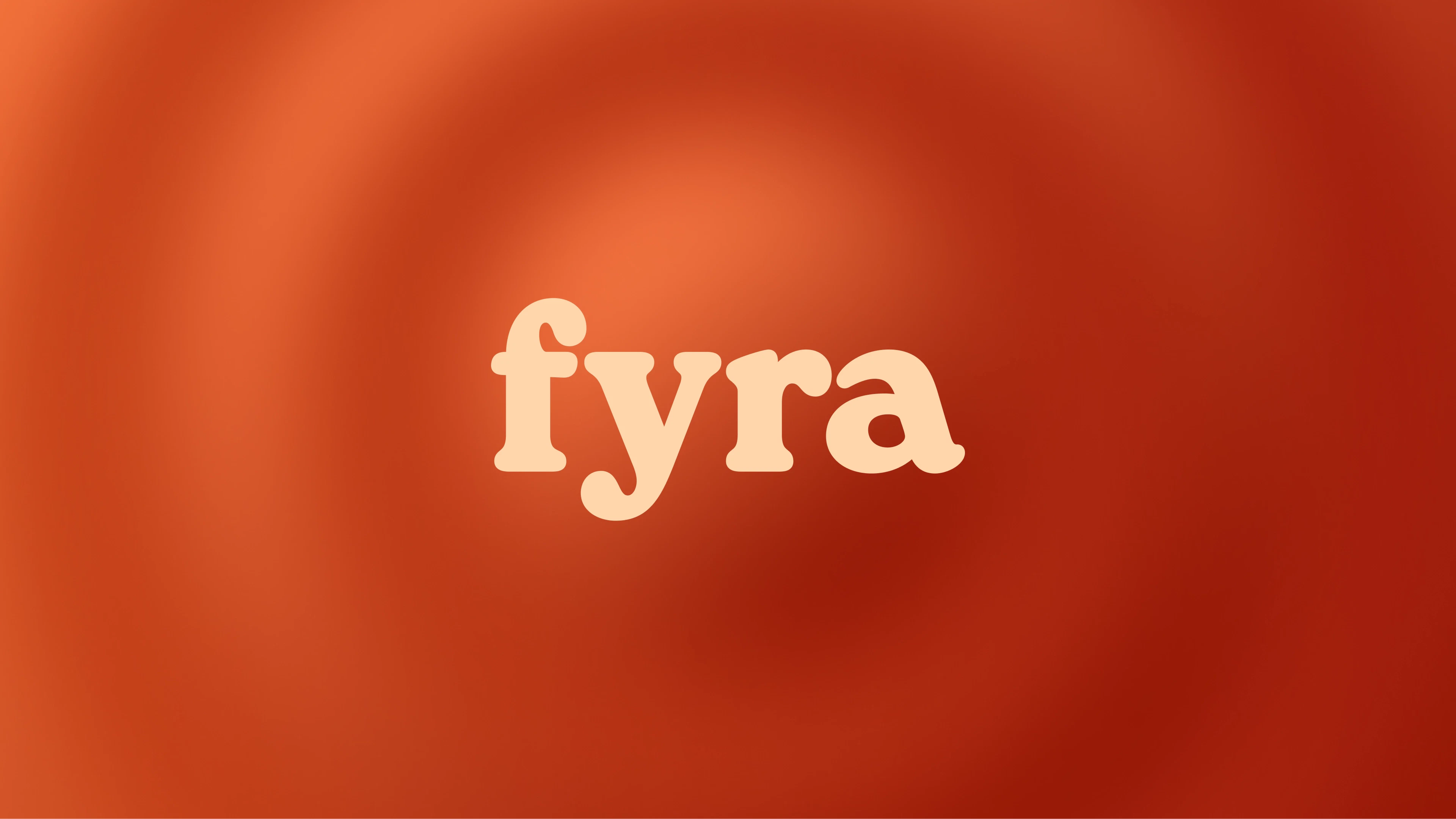
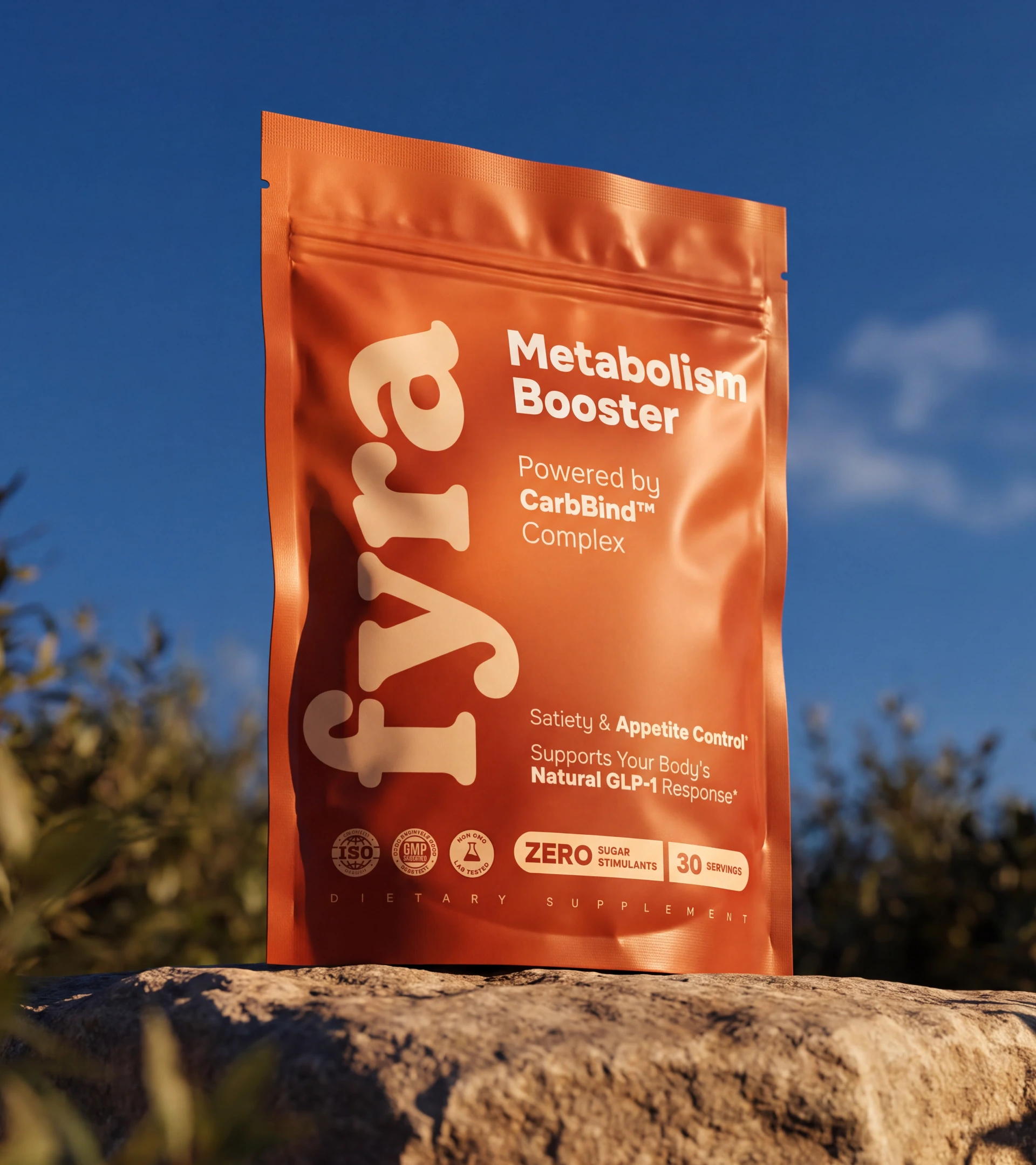
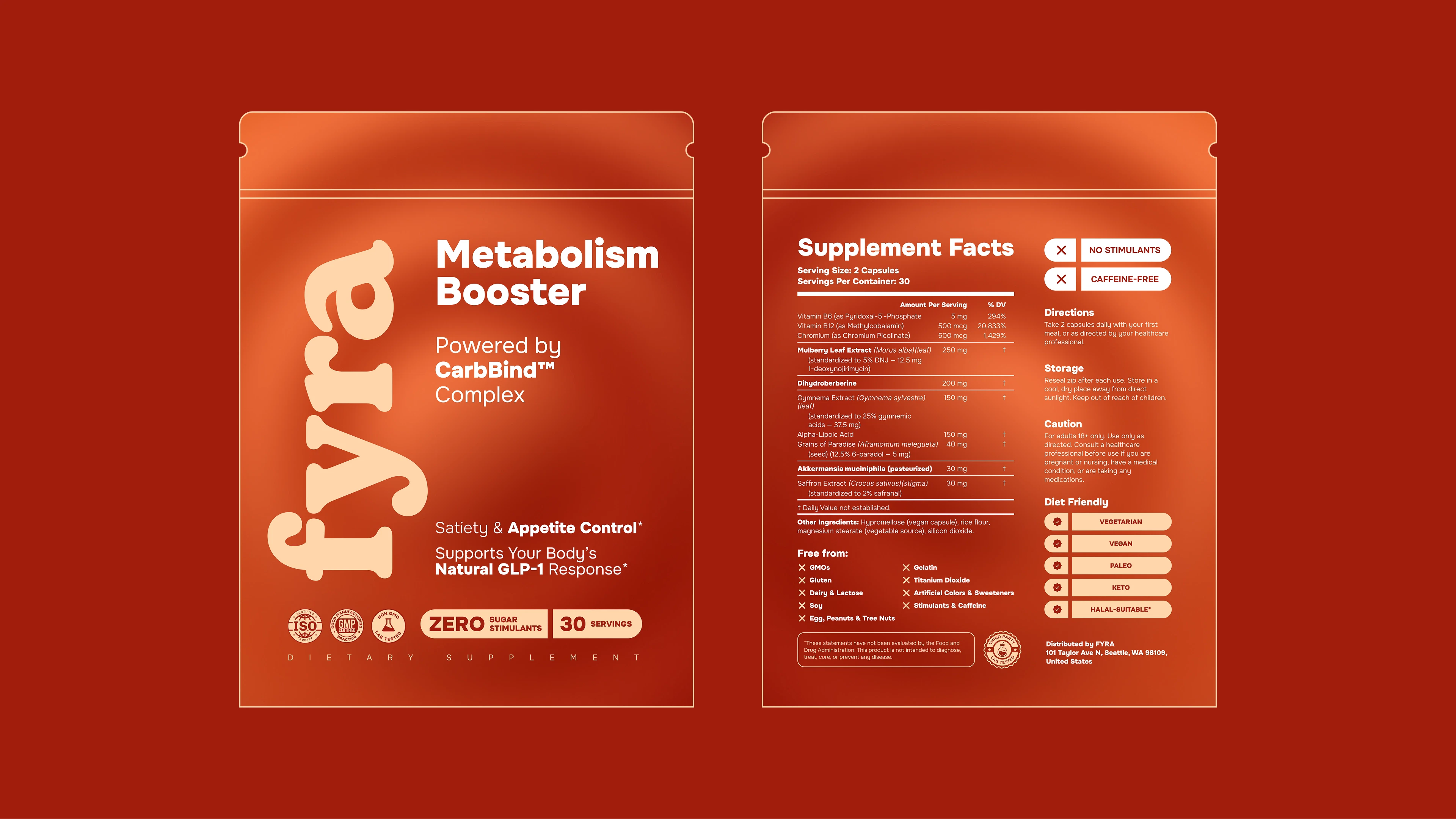
- A soft lowercase wordmark that anchors the pack.
- An autumn-to-orange gradient that feels closer to specialty coffee than to a fat burner.
- CarbBind™ Complex as a visible hero of the pack.
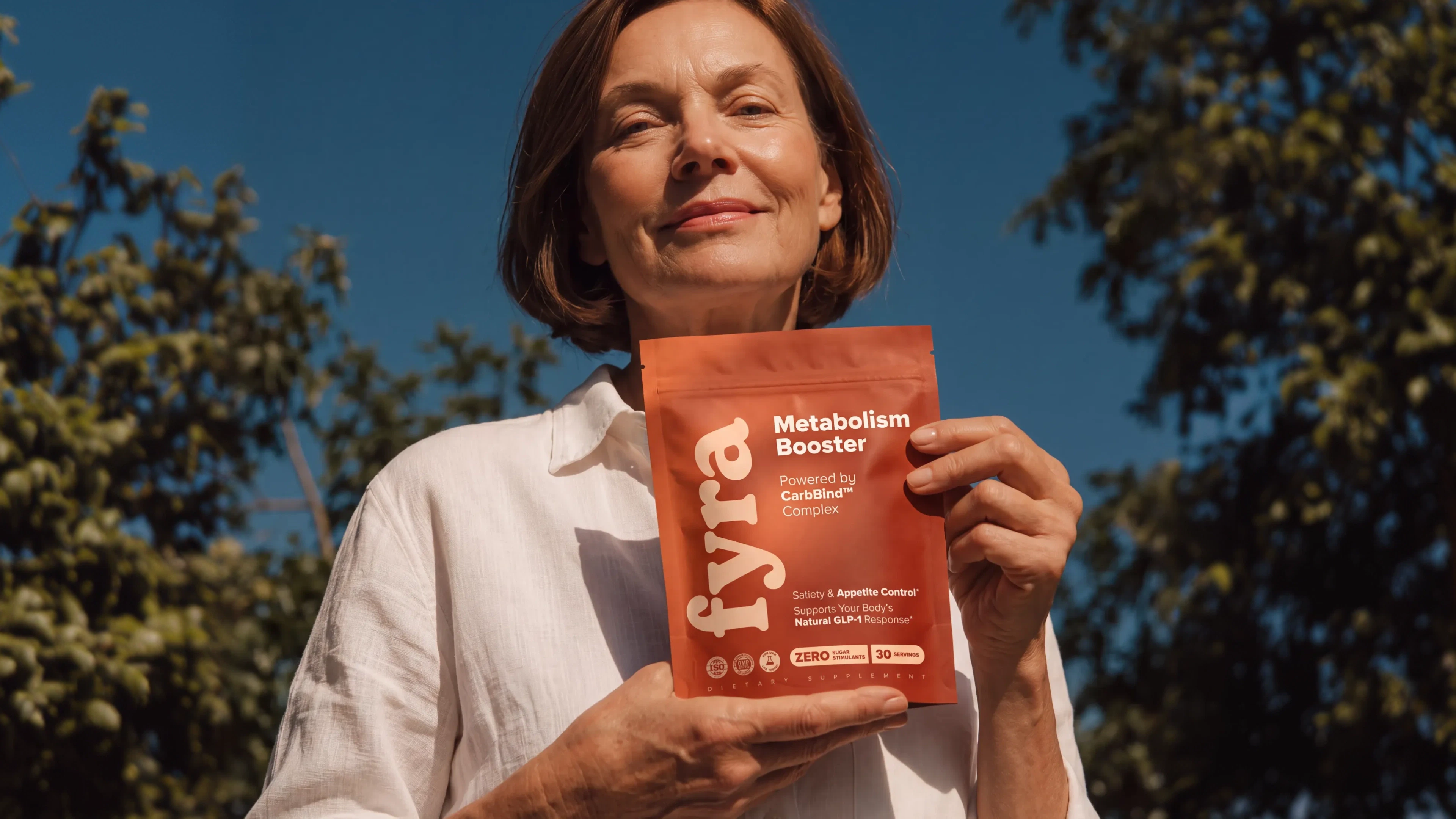
- Sunlit editorial photography that keeps the brand human, never clinical.
- A system built to convert cold Meta traffic within seconds and hold its own next to premium wellness brands.
Validation
The brand is in production and already on sale.


Project team
- Head of AgencyOtari Arutyunyan
- Project ManagerKirill Zelensky
- Art Director, Brand DesignerValeria Dubych