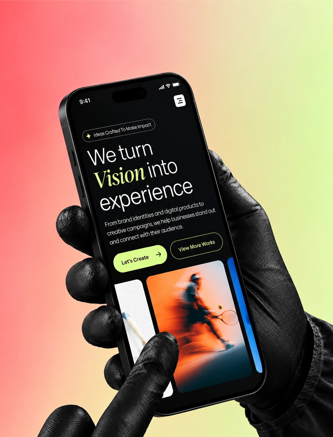
Most discussions about landing pages come down to design: which font to choose, which palette to use, where to place the button. But in practice, conversion is determined not by how the page looks, but by how well each of its sections accomplishes its task.
A good landing page has no decorative sections. The Hero helps visitors quickly understand whether the offer is right for them. Social proof builds trust through the experience of other buyers. Benefits explains the product's value. Comparison helps choose between alternatives. Credibility confirms the brand's claims. Results timeline sets realistic expectations regarding timing. CTA helps take the next step. FAQ answers final questions before purchase.
If a section does not perform any of these functions, it does not help the page — it distracts attention and complicates the user's path to a decision.
In this article, we will break down a landing page section by section: what task each of them solves, how it looks on real DTC brand examples (AG1, Proactiv, Eight Sleep, Cymbiotika, Nutrafol, and others), and which common mistakes lower page performance. After each section, you'll be able to look at your own landing page and ask a simple question: what task does this section solve?
This article will be useful for marketers, product managers, DTC brand founders, and anyone responsible for landing page performance who wants to understand not just what works, but why it works.
A customer's path to a decision across landing page sections
1. Hero section — conversion starts before the first scroll
The hero section is the first screen of a landing page, everything a user sees before scrolling for the first time. Its task is to answer the question "Is this for me?" before the visitor decides to leave the site.
The seller talks about the product — its features, capabilities, and solutions. But at this moment, it is more important for the visitor to understand what they will get and why they should care.
Principles of a landing page hero section
A strong Hero section does five things simultaneously:
explains what it is;
signals who it is for;
shows the result instead of describing it;
removes objections;
makes the next step obvious.
Clear landing pages are better than creative ones with vague descriptions. Every element of the page must serve a specific function. If an element is present because "it looks nice," it works against conversion.
Let's look at this with a specific example of the Hero section on the AG1 homepage.
AG1 landing page hero: headline, offer and CTA
AG1 Hero Section
Headline: "Better Mornings, No Matter Hugh You Are."
This is a light play on words with Hugh Jackman's name. The most important words here are the first two: "Better Mornings" — the result that customers get. Instead of mentioning vitamins, ingredients, or starting with "feeling tired?" or "care about your health?", the headline begins with the desired outcome. The wordplay holds attention a second longer. As a result, you've captured the person's attention, and they want to read further.
Subheadline: "Since 2021, AG1 has been the morning ritual that keeps Hugh Jackman at the top of his game." — this is social proof, evidence from an authoritative figure that reinforces the credibility of the statement. Hugh Jackman has been using the product since 2021, meaning it is a long-term habit rather than a one-time paid partnership. For a health-aware consumer who has seen every paid partnership in the category, this distinction is very noticeable.
A good subheadline complements and adds weight to the words in the headline. Most brands simply repeat the point from the headline using different words in their subheadline, which does nothing to boost conversion.
In the background of the Hero section, there is a video of the actor in motion: energetic, at home, holding an AG1 drink. The product is in the shot, but not the focus; the emphasis is on the person and the feeling. AG1 is selling the idea of a healthier, more energetic, and happier life.
Even before the visitor sees the headline, right at the top of the page, there is already a sticky bar: "LIMITED TIME SALE. NOW $67 (WAS $87) ON YOUR FIRST ORDER + FREE SHIPPING". This is a so-called friction-reducer — an element that removes some of the hesitation before the user even begins to evaluate the product. The visitor is immediately shown two things that make the offer more appealing: a lower price than usual and free shipping.
Notice how AG1 first gives a person an additional reason to continue learning about the product, and only then starts persuading them to buy.
The "Shop Now →" CTA is in a rich signature green, positioned at the bottom left where the eye naturally lands after reading the headline. Next to it is a "Learn More" button for those who aren't ready to buy yet and want to learn more about the product first.
You can create separate landing pages for hot, warm, and cold leads. But if you have just one landing page for everyone — make sure it works for everyone.
An important addition: the AG1 Hero section has no star ratings, no "50,000+ customers" counter, and no banner with press logos. They rely entirely on the image of the person you want to become, like Hugh Jackman — a person with discipline and energy. AG1 defers standard Social Proof mechanics to sections lower down the page. This approach works when the role model is prominent enough to carry the entire Hero section on their own. Read more about AG1's tactics in our article "The AG1 Phenomenon: How a Green Powder Rewrote DTC Rules."
Psychological Mechanism
Identity-based persuasion is an effective mechanism for influencing purchase decisions. The visitor buys the lifestyle associated with the product: discipline, energy, and health consciousness. The headline, visual, and product in hand all work toward a single idea: "I want to be that kind of person."
Typical Mistake
Using a celebrity or influencer in the Hero section as a decoration rather than proof — for instance, simply placing a smiling face next to the product. The difference between AG1's subheadline ("since 2021, this has been his morning ritual") and a generic endorsement quote lies in specificity and duration. When a brand shows a real habit formed over years, it is perceived as authentic experience. Meanwhile, generic praise and vague recommendations often look like just another ad.
Goal
Every element of the Hero section must work toward conversion — answering the visitor's question, removing an objection, or guiding them to the next step. Elements present purely for aesthetic reasons increase cognitive load and lower conversion.
2. Pain-point section — helping the visitor solve their problem
Not all visitors arrive at the page with the exact same problem. This is especially common for brands with a wide product range — such as supplement or telemedicine companies.
In such cases, the primary goal of the page is not to sell a specific product, but to help the person quickly find the solution that is right for them. That is what the pain-point section is for. Instead of a product list, it offers the choice of a problem the person wants to solve or a result they want to achieve. Each option leads to the next step: a dedicated page, a quiz, or a personalized offer.
Diagram of a pain-point section on a landing page
Logic is simple: a product catalog forces visitors to figure out on their own which product fits their needs. This requires extra effort and complicates the decision. The pain-point section works in reverse: the person selects their goal in a language they understand, and the brand links that choice to the appropriate product or solution.
Bioma.health Pain-point section
Bioma pain-point section where customers pick their problem
The section is called "Find the formula your body needs" and consists of a grid of nine cards. Each card is dedicated not to a product, but to a specific goal or problem: "Weight loss", "Bloating relief", "Vaginal comfort", "Hair, skin & nail care", "Menopause comfort", "Gut reset", and others. Clicking on any of them leads to a separate page with additional information and a product that helps solve that specific issue.
The strongest decision here is the focus on the result rather than the product. Bioma does not offer visitors the task of figuring out formulas or choosing between supplements. Instead, the brand starts with what really matters to the person: what outcome they want to achieve or what problem they are trying to solve.
This simplifies the choice. People usually think in categories like "get rid of bloating," "lose weight," or "improve skin condition," rather than ingredient names and formulas. The brand adapts to this logic and helps transition from a goal to a suitable solution. An additional role is played by the arrow on each card — it makes it clear that the element is clickable and leads somewhere.
The badges also serve a specific purpose. For example, the orange "POPULAR" tag on the "Weight loss" and "Night metabolism" cards acts as a subtle social proof signal: it indicates which areas attract the most interest from other buyers. Meanwhile, the green "NEW" tag highlights new products and categories.
What could be improved
The "NEW" badge is used on four out of nine cards simultaneously. When there are too many new offers, the signal itself loses its impact. Badges work better when applied selectively: one or two truly important new items attract more attention than several identically marked cards.
Forhers.com Pain-point section
Pain-point cards above the hero on the Hers landing page
Hers names their section "The care you've always deserved" and designs it as a dashboard of varied card sizes. Priorities are instantly clear: the "Start your weight loss today" card takes up the most space, with a result-promising card placed next to it — "See how much weight you can lose". Below are less prominent areas: "Hair loss", "Menopause", and "Health screening". Each card leads to a dedicated quiz related to the corresponding issue.
The last card deserves special attention: "Unsure where to begin? Start here". This is a thoughtful solution for visitors who are uncertain about which category fits them best. Instead of forcing the person to figure it out on their own or risking losing their attention, Hers offers a simple next step — take a short quiz and get recommendations.
Card sizing also plays an important role. Through visual hierarchy, the brand shows which areas it considers priorities. Weight loss gets the most attention, while other categories remain available but take a secondary place.
The placement of the section is also interesting — Hers positions the Pain-point section above the Hero section, occupying nearly half of the first screen. At the same time, the Hero section headline "Your weight loss breakthrough is here" still remains visible. As a result, the very first action on their page is searching for one's situation among the suggested options rather than reading brand promises.
Why this works
Both Hers and Bioma solve the exact same task: helping the visitor quickly find what applies directly to them.
Instead of sending a person to a general product catalog, they offer to start with a problem or a goal. This approach simplifies the decision and makes the interaction feel more personal. When a person chooses a direction themselves, the likelihood that they will continue exploring the product increases.
The "Unsure where to begin?" card reinforces this effect. It helps those who cannot clearly assign themselves to a specific category yet, providing them with a clear path instead of forcing a blind decision.
Psychological Mechanism
This relies on self-identification — people engage much more readily when they see a situation on the page that mirrors their own.
Furthermore, a choice made independently is usually perceived better than an imposed offer. The Pain-point section leverages this exact principle: it begins not with a product, but with a problem or result that already exists in the visitor's mind.
The faster a person recognizes their situation among the cards, the stronger the feeling that the brand understands their needs and offers a solution crafted specifically for them.
Typical Mistake
Showing products instead of problems in this section, or offering a long list of equally prioritized options without any clear visual hierarchy.
When all cards look identical, the visitor has to figure out where to start on their own. And if a person isn't sure what they need yet, the absence of an option like "Unsure where to begin" creates an extra friction point.
Goal
The pain-point section should help the visitor quickly identify their situation and move toward the most suitable solution. Its task is not to force the person to search for the right product, but to help them understand where to start.
The visitor arrives with a problem, not a product name. The faster they recognize their problem on the page, the higher the chance they will stay.
3. Social proof — borrowed trust
People rarely make a decision simply because a brand makes a claim about itself. The experience of other buyers inspires far more trust.
Diagram of a social proof block on a landing page
Social proof on a landing page is designed specifically for this purpose. While the Hero section creates the first impression, reviews and user stories help confirm it. This is where the visitor looks for answers to the questions: "Has anyone tried this before me? What kind of results did they actually get?"
This is especially crucial because most users arrive at the page with a degree of skepticism. They have already seen dozens of similar claims. Social proof helps turn brand claims into something far more convincing — the experience of real people.
Let's look at how this works using the Proactiv page as an example.
Proactiv social proof: UGC and before-and-after photos
Proactiv Social Proof
Proactiv uses two distinct Social Proof formats, placed sequentially.
The first is a UGC carousel: three videos from real buyers, shot on mobile phones, holding the product. No filters, no studio lighting, no staging. It is precisely this "unpolished" nature that works: these videos are perceived as authentic rather than promotional material. Next to it is the text "WHAT OTHERS ARE SAYING," which functions as both a section title and a social signal: people are publicly discussing the product.
The second block carries the headline "CLEAR SKIN, CLEAR RESULTS," which describes the outcome. Brands typically use titles like "Our Customer Reviews" or "What Clients Say" for Social Proof sections, but Proactiv focuses on what clients actually achieved. This minor detail alters how the visitor perceives everything underneath it.
The quote from Victoria deserves special attention. It features a direct comparison with competitors: "The other systems I tried before Proactiv were always so complex." This is a rare tactic where the buyer makes the comparison instead of the brand. Such a comparison, voiced by a third party, carries far more weight than a similar statement in the company's own copy. Positioned next to the quote are a product photo and a direct "shop now" link — Proactiv leaves no gap between the moment of conviction and the path to purchase.
To the right of the quote are before/after photographs labeled "BEFORE" and "AFTER" alongside a time-based disclaimer: "Results depicted are based on a 14 week period." The specific timeframe of "14 weeks" shifts the visual outcome from an "abstract promise" into a "measurable fact."
Why this works
Proactiv combines two proof formats in a single section: authentic UGC and verified before/after visuals. Each format serves a specific purpose. UGC conveys scale and authenticity — "there are many people like me." Meanwhile, before/after imagery helps answer the primary question in this category: "What result can I expect for myself?" through visual proof of a specific outcome within a defined timeline.
What could be improved
Victoria is cited without a last name, age, or context regarding who she is, where she is from, or how long she struggled with the issue. Anonymity in a review reduces its impact: the visitor cannot determine whether her situation resembles their own. Compare: "Victoria" versus "Victoria, 24, Austin, Texas, had acne since age 16." The second option neutralizes the "this doesn't apply to me" objection before it can even take shape.
Additionally, an aggregate rating — star ratings and review counts — is absent from both blocks. This is a signal of scale that Proactiv leaves unused, despite having a sufficient volume of reviews to make it effective.
ARMRA Social Proof
ARMRA reviews block built around one detailed review
ARMRA shows a single large review in the center of the screen instead of star ratings and a grid of cards, positioned right before the product block "Discover our favorites", just as the person is mentally prepared to shift from reading to choosing. This approach bets on the depth of one compelling story, delivered at the exact moment the visitor is ready to browse products.
Why this works
Because stars and percentages only answer the question: "are people generally satisfied?" But what a person usually cares about is something else: "Will this work for me? Or at least for someone like me?"
This is where a detailed story proves stronger than cold metrics. When a relatable life scenario appears — such as postpartum recovery — the review stops being an abstraction. It turns into a relatable narrative where readers can see themselves, a friend, a spouse, or a loved one. Suddenly, choosing the product is no longer seen as just making a purchase, but as a potential solution to a familiar problem.
What could be improved
The review stands alone and lacks context: who Mary C. is, how old she is, or how long she has been taking the product. Anonymity reduces the story's impact and leaves the "does this really apply to me?" objection unresolved. A single strong story almost always performs best when paired with a signal of scale — such as star ratings and total review count nearby — so that depth is reinforced by numbers.
In practice, the most convincing review block usually combines both approaches. One strong personal story establishes an emotional connection, while an aggregate rating, review count, or verified buyer badge alongside it demonstrates that this is not an isolated case, but the experience of many people. Depth plus scale together work better than either one alone.
Primal Queen Aggregate rating
Aggregate review rating on the Primal Queen landing page
While individual reviews tell a single person's story, an aggregate rating reveals the bigger picture — "how many people have actually tried the product and walked away satisfied?" The average score, total review volume, and verified buyer badges serve as immediate visual trust anchors.
This format persuades not through dramatic storytelling, but through collective consensus. It mitigates a very human anxiety: "What if it doesn't work for me?" When positive reviews number in the hundreds or thousands, the perceived risk drops significantly — even if the buyer isn't consciously aware of it.
At Primal Queen, the Aggregate Rating section opens with the headline "See What Primal Queen Can Do For You" and immediately surfaces what most visitors look for first: an average rating of 4.6 out of 5 based on 24,229 reviews, paired with a complete star-breakdown distribution alongside it.
Above the review stream, they place topic filters tailored to their audience's primary health concerns — "Weight Loss", "Hormones", "Hysterectomy", "Iron Deficiency", "Low Energy", "Perimenopause", "Menopause" — as well as a customer photo gallery and sorting controls. Below sit the individual review cards, complete with "Verified Buyer" badges, summary titles, and user-submitted result photos.
Why this works
Primal Queen simultaneously showcases scale and transparency. A volume of 24,229 reviews is a massive social signal on its own. It signals widespread adoption, assuring the visitor that they aren't dealing with an untested or obscure brand.
However, the real strength lies in showing the full star breakdown. The brand doesn't hide lower ratings or attempt to project flawless perfection. Visitors can see the 1-, 2-, and 3-star reviews right alongside the 5-star praise. This makes the overall rating far more believable — a 4.6 average feels much more authentic than a pristine 5.0 with zero negative feedback. When buyers see that critical reviews aren't scrubbed, their trust in the positive ones increases dramatically.
The situation-based filters are another high-converting element. A visitor navigating perimenopause can filter specifically for "Perimenopause," while someone recovering from a hysterectomy can select "Hysterectomy." Instead of wading through pages of irrelevant feedback, they immediately see stories from people in their exact situation. This dismantles one of the most stubborn friction points in DTC: "Sure, it worked for them, but my case is different."
The more specific the proof, the higher the trust. The more abstract the claim, the more it sounds like just another advertisement.
What could be improved
The section itself is executed exceptionally well. The only real upgrade would be surfacing the review source. Nowhere in this section does it mention the platform or third-party service aggregating these customer reviews. A simple badge like "Verified by Trustpilot" would add an extra layer of credibility and dismantle the lingering question: "did the brand just manufacture these numbers themselves?"
Psychological Mechanism
When people face uncertainty in a buying decision, they look to others for validation — especially with products whose results cannot be evaluated in advance.
This is precisely why reviews work. They reassure visitors that people with similar needs have already taken the leap and seen tangible outcomes. The more granular the details in a review — age, specific health context, time-to-results, exact improvements — the easier it becomes for the reader to project themselves into that story, making the endorsement vastly more persuasive.
Typical Mistake
Publishing generic, context-free reviews. Phrases like "Great product, highly recommend!" are not real social proof. They explain nothing and do zero heavy lifting to validate marketing claims. A high-converting review requires three core components: a specific outcome, a concrete timeline, and enough personal detail for the visitor to recognize their own situation in the story.
Goal
Social proof must validate product quality while directly resolving specific objections held by the target audience. Every format — UGC, before/after visuals, aggregate ratings, and customer quotes — serves its own distinct purpose. A combined approach leveraging multiple formats will consistently outperform any single format used in isolation.
4. Benefits section — focus on what the visitor gains, not what the product does
There is one mistake made by nearly all landing pages, and it is so widespread that it becomes almost invisible: confusing product features with customer benefits.
A feature is what the product is or does. A benefit is what that means for the person on the other side of the screen.
The distinction seems subtle, but in practice, it is remarkably difficult to maintain — simply because the team building the landing page knows the product exponentially better than they know the prospective buyer. The result? A Benefits section that reads like a technical spec sheet, converting visitors accordingly.
Let's look at how Eight Sleep solves this exact challenge on their Pod mattress landing page.
Diagram of a product benefits section on a landing page
Benefits section on the Eight Sleep landing page
Eight Sleep Benefits Section
The top part of the section is built around an animated, interactive headline: three words cycle through sequentially — "Temperature", "Elevation", and "Sound". Each word represents a core capability of the product. But Eight Sleep does not stop at listing functions. Immediately below the active word, copy appears explaining the direct value that function provides to the user.
For example, under "Sound," the copy reads: "Integrated surround-sound built into the Base helps you unwind, drown out background noise, and stabilize your sleep environment all night." Instead of merely describing an integrated audio system, Eight Sleep focuses on the outcome: helping you relax, drowning out background noise, and maintaining a optimal sleep environment. Alongside naming the feature, they explicitly articulate its value to the user.
The lower part of the section — titled "Whatever your sleep challenge, the Pod meets you there" — accomplishes something rarely executed well on DTC landing pages: addressing distinct audience segments within a single section. Three cards present three distinct usage scenarios and three targeted messages:
COUPLES → "Sleep in perfect harmony"
"Dual-zone technology keeps each partner at their ideal temperature, ending thermostat battles and helping you both rest better together."
The phrase "thermostat battles" resonates because it taps into a deeply relatable everyday friction point. Instead of explaining the engineering behind dual-zone temperature regulation, Eight Sleep highlights the exact household conflict it eliminates. The focal point shifts from technology to living together more comfortably.
MENOPAUSAL WOMEN → "Relief from hot flashes, every night"
"The Pod keeps your side of the bed cool all night to help prevent overheating. If a hot flash wakes you, you can hit a button to cool down fast, then it slowly returns to your normal sleep temperature."
Notice the level of granular detail here. The copy walks through a precise sequence of events: you wake up from a hot flash, press a button, the bed cools rapidly, and then slowly returns to your baseline sleep temperature. Rather than offering an abstract promise, Eight Sleep illustrates what actually happens in a real-life moment. For someone experiencing this regularly, this level of specificity demonstrates genuine empathy rather than standard marketing fluff.
WELLNESS SEEKERS → "Optimize every night"
"Continuous monitoring of heart rate, HRV, and temperature gives actionable insights to optimize recovery, focus, and longevity."
Here, Eight Sleep pivots to a completely different persona — individuals who track bio-metrics, analyze personal data, and seek performance optimization. Mentioning metrics like HRV (heart rate variability) serves as a clear beacon that the product is engineered for data-driven consumers. Instead of watering down the language for a general audience, the brand uses domain-specific terminology that helps this audience instantly recognize themselves.
Why this works
The standard approach to a Benefits section is a single, generic checklist for every visitor. Eight Sleep takes a segmented path, crafting distinct messaging vectors tailored to specific buyer archetypes. Consequently, each visitor encounters a scenario mirroring their lived experience and receives arguments directly relevant to their needs.
This strategy requires a much deeper understanding of the customer base: first identifying key segments, then formulating tailored value propositions for each. However, this extra work produces a vastly more compelling page: visitors can easily project themselves into the copy and understand exactly how the product solves their specific problems.
Typical Mistake
Writing a Benefits section intended for "everyone." Copy that attempts to appeal to every potential buyer simultaneously ends up generic and weak. A few highly specific benefits that land precisely on the pain points of key target personas will always outperform a laundry list of one-size-fits-all claims.
Goal
The Benefits section must explain not what the product does, but what problem it solves for a specific individual. The easier it is for a visitor to recognize their own situation in the copy, the higher the probability they will advance along the path to purchase.
5. Ingredients section — what is actually inside the product
For supplements, nutraceuticals, and other consumable products where results aren't immediately visible, visitors need to understand precisely what they are paying for. This is where the Ingredients section — or "What's inside" — comes into play.
Diagram of an ingredients section on a supplement landing page
Its goal is to show the formulation while explaining why each ingredient was included in the product and what role it plays. A strong Ingredients section helps connect the components to the expected result, builds trust in the product, and helps justify its price point.
Here, brands often fall into one of two extremes. The first is a dry list of ingredients and dosages that feels like a back-of-pack nutrition label. The second is a collection of loud promises devoid of numbers, explanations, or proof. A powerful Ingredients section merges these two approaches: it showcases the composition, explains its significance, and whenever possible, backs up its claims with data.
Primal Queen Ingredients section
Ingredients section on the Primal Queen landing page
The section headline sounds maximally confident: "Primal Queen's Female-Focused Organ Superfoods are Hands Down THE MOST Nutrient-Rich On The Planet," while the subheadline immediately sets the context: "Here's why we hand-picked these 6 beef organs."
At the center are six cards, each built on the same principle: an animal organ is compared to a familiar plant-based food through a specific nutrient. For example, Beef Liver contains "4.2X MORE Vitamin A than lettuce," Beef Heart contains "14,000X MORE CoQ10 than cauliflower," Beef Kidney contains "3.4X MORE Iron than kale," and Beef Uterus contains "100X MORE Vitamin B12 than spinach."
At the bottom of the section sit the "UNLOCK YOUR TRUE POWER" CTA, along with "365-Day Money Back Guarantee" and "Free Shipping" trust badges.
The primary strength of this section is that it goes beyond merely listing ingredients. Every component is explained through comparison. The "organ vs. plant" format translates an abstract claim about high nutritional value into a concrete, easily digestible message.
The subheadline also does heavy lifting. The wording "hand-picked these 6 beef organs" proactively answers why these specific ingredients were selected for the formulation.
Placing the CTA directly next to the ingredients breakdown is another smart move — if visitors are persuaded by the arguments in this section, they don't have to look elsewhere on the page to take the next step.
What could be improved
Some comparisons look striking on the surface but leave room for skepticism. For instance, claims like "14,000X more CoQ10 than cauliflower" or "100X more B12 than spinach" grab attention, but without citing a source or stating absolute dosages, they are difficult to verify.
Furthermore, the comparisons are drawn against foods that aren't primary sources of those specific nutrients to begin with. As a result, savvy visitors might question the framing. It would be far more compelling to display the actual nutrient amount per serving alongside dataset citations. Relative comparisons work well to hook attention, but only absolute numbers demonstrate true dietary value.
Psychological Mechanism
Two key principles are at work here simultaneously:
Specificity — people process information much faster through comparisons with familiar objects than through abstract dosages or scientific terminology. A phrasing like "100X more than spinach" lands far quicker than a long list of milligrams and percent daily values.
Transparency — when a brand thoroughly reveals its formulation and explains the function of every ingredient, the product feels far more tangible and trustworthy.
Typical Mistake
Falling into one of two extremes: either listing ingredients and dosages with zero context (leaving visitors clueless about why the formulation matters), or relying strictly on high-level marketing claims without numbers or proof (leaving visitors with no reason to believe them).
Goal
The Ingredients section must explain not only what goes into the formulation, but why each component is necessary. Its objective is to help visitors understand the full value of the product and establish a clear link between the ingredients and their expected outcome.
6. Product Comparison — why choose your product over the alternative
By the middle of the landing page, many visitors are already evaluating their options:
Comparing it with a competitor's product they researched earlier
Comparing it with the current solution they are using right now
Or even considering the option of doing nothing and making no purchase at all
This internal comparison happens in their minds regardless of whether you guide them or not.
This is precisely where the Comparison section comes in. Its purpose is not to convince the visitor that all alternatives are terrible, but to help them navigate the decision-making process. A well-designed comparison section highlights the criteria that truly matter and explains how different choices actually stack up against one another.
Diagram of a competitor comparison table on a landing page
Therein lies the core risk. Any comparison created by the brand itself is inherently perceived as biased. If a matrix makes the product win across every single parameter without exception, consumer trust rapidly deteriorates. Visitors are highly sensitive to the line between an objective attempt to explain key differences and a one-sided promotional pitch.
Therefore, a strong Comparison section does not try to prove that the product is universally superior in every conceivable way. Its true goal is to demonstrate for whom and in what specific scenarios this particular option is the optimal choice.
Let's break down two distinct structural approaches using Cymbiotika and Create.
Cymbiotika Product Comparison
In their "How we compare to our competitors" comparison matrix, Cymbiotika avoids calling out specific competing brands directly. Instead, they position themselves against broader supplement formats: "Pills & Powders" and "Gummies." Visual hierarchy does immediate work here — the Cymbiotika column features a bright, highlighted background against darker neighboring columns, ensuring the eye lands on their core offer first.
Cymbiotika comparison table against competitors
This is a brilliant decision because, rather than initiating a direct line-by-line head-to-head against a specific competitor, the brand contrasts entirely different delivery mechanisms aimed at solving the exact same problem. As a result, the psychological dynamic shifts from "Which brand should I buy?" to "Which delivery format fits my life best?" This framing feels significantly less aggressive and allows the brand to articulate its unique value proposition without adopting an adversarial tone toward rival brands.
Take the matrix row labeled "Efficacy / superior absorption": instead of relying on generic checkmarks, it uses explicit, quantified equivalents — 1 packet of Cymbiotika versus 3 pills or 12 gummies from alternative options. This distinction is critical because it grounds an abstract claim like "higher bioavailability" in an everyday, physical reality. Swallowing 12 gummies a day is a tangible, slightly absurd scenario that anyone can instantly visualize. These are the exact micro-details that allow visitors to evaluate the functional difference between options in a split second.
The remaining evaluation criteria — ingredient quality, taste, convenience, and finished-product clinical trials — are mapped out using standard checkmarks and cross marks to continuously highlight Cymbiotika's advantages.
What could be improved
The core flaw in Cymbiotika's matrix is that they win across every single variable without exception. While brands often assume a clean sweep looks persuasive, an item that beats all alternatives on every axis triggers immediate consumer cynicism, shifting the perception from an objective breakdown to an engineered ad asset.
The comparison would gain massive authority if the brand acknowledged at least one real trade-off. For instance, gummies might be recognized as a more approachable option for kids, or standard pills as a lower upfront cost. Allowing competing formats to hold one or two minor wins makes the brand's primary advantages infinitely more believable.
A secondary issue lies in heavy claims like "gold standard clinicals on finished-product." For a high-intent shopper, this is a massive trust anchor, but the matrix provides zero verification. Linking directly to clinical studies, lab certificates, or third-party verification badges directly beside the claim would transform a promotional assertion into undeniable proof.
7. Self-Product Comparison — guiding choices within your own lineup
The exact same comparison principle applies when the "competitor" is simply another product within your own product line. Here, the objective is no longer to demonstrate superiority over an external brand, but to eliminate decision paralysis and help the buyer confidently select the right variant from your catalog.
Comparison of two Primal Queen products on a landing page
A common variation of this approach is comparing a one-time purchase versus a recurring subscription. The matrix displays both options side by side, but systematically layers value onto the subscription tier: a lower price per unit, free shipping, exclusive bonuses, or zero-friction cancellation terms. Consequently, a subscription ceases to feel like a restrictive commitment and shifts into the most economically rational choice.
Brands also frequently employ internal price anchoring using a good–better–best framework. Positioning options with distinct price points side by side justifies higher-tier pricing through additional features, higher quantities, or elevated perks. This setup subtly rewires the user's decision-making process: instead of deliberating "Should I buy this or not?", they begin asking "Which of these tiers aligns best with my needs?"
Under this psychological framing:
The entry-level option serves as a low-friction baseline.
The mid-tier option emerges as the logical sweet spot for most consumers.
The premium option anchors top-end value for power users seeking maximum results.
In both cases, the exact same principle applies: the brand doesn't persuade the visitor to buy, but rather lays out the options in advance so that the desired choice feels like the most logical one. However, striking the right balance here is crucial. If the one-time purchase or the lower-priced version feels artificially stripped-down, the visitor senses an attempt to manipulate them, and trust in the comparison declines just as it would with an unfair competitor matrix.
Psychological Mechanism
When faced with too many choices, people try to simplify the decision by comparing products across a few key criteria. That is precisely why whoever sets those criteria dictates how the visitor perceives the available options (anchoring and choice architecture).
The primary role of the Comparison section is to establish the framework within which a person evaluates your product, and only secondarily to display product data.
Typical Mistake
A comparison in which the brand wins across every single parameter ends up looking like an attack on competitors rather than a helpful buying guide.
Goal
The Comparison section should help the visitor make the comparison in the right direction, because they will compare your brand with alternatives either way. A strong table shows the differences and helps them understand which option is the best fit for a specific person.
8. Credibility section — third-party validation and verified trust
Social proof helps borrow trust from other buyers: "People like me have already tried this product and were satisfied with it." However, customer reviews cannot answer whether a product is actually safe, how seriously the brand approaches quality control, or whether its claims are backed by rigorous research and real testing.
Diagram of a credibility section on a landing page
The Credibility section answers the question: "Why can this brand be trusted?" It leverages independent testing, certifications, scientific research, and manufacturing standards. This form of trust relies on third-party validation from official organizations and industry experts. For products related to health, nutrition, or finance, this section often plays a decisive role in the purchasing decision.
Social proof says: "People like you have already tried this product and were happy with it." Credibility says: "The brand's claims are backed by independent sources."
AG1 Credibility Section
AG1 credibility block: testing and certifications
The section headline — "Independently tested. For your peace of mind" — works well across both sentences. AG1 doesn't stop at announcing that the product underwent third-party testing; they immediately clarify why this matters to the buyer: to give them peace of mind and confidence in their decision. This follows the exact same principle seen in the Benefits section: a feature on its own is far less compelling than its ultimate value to the user.
The section is laid out in a two-column format. On the left are the headline, body text, and an accordion-style collapsible list. On the right is a large image depicting a laboratory process. While the visual carries little informational weight by itself, it effectively sets the expected context: research, testing, and quality control.
The sub-topics are grouped into collapsible accordions and kept closed by default. Here, this design choice feels justified, unlike in an FAQ where users typically scan for immediate answers to specific questions. In a Credibility section, the accordion headers themselves handle most of the heavy lifting — even during a quick skim, visitors capture the primary trust signals: research, certification, testing, and safety. The underlying technical details remain easily accessible for those who wish to dig deeper.
For AG1, this section coordinates directly with their Hero section, which deliberately avoids traditional trust mechanics like ratings, counters, or press logos. Instead, the brand leans into lifestyle framing and the figure of Hugh Jackman. The hard evidence doesn't disappear; it simply enters later in the funnel — appearing once visitor interest is primed and the need for scientific validation arises.
What could be improved
With all accordion rows closed by default, the actual proof elements stay hidden. The headers declare the benefits — "certified safe," "backed by research" — but the supporting evidence only reveals itself after a click. Given that most users won't interact with every single toggle, key proof points risk being missed entirely. Utilizing a fully expanded grid layout or implementing an auto-advancing toggle highlight could significantly improve visibility.
For a skeptical prospect, tangible verification speaks much louder than broad claims. Displaying the logo of a certifying body, naming an independent laboratory, or hyperlinking a published study builds far more authority than simply asserting that a product is "backed by science." The highest-converting Credibility sections do not merely tell users about testing and certificates — they explicitly show them.
Typical Mistake
Claiming reliability and a scientific foundation without presenting concrete evidence.
Phrases like "backed by science" or "expert-verified" carry little weight on their own. If visitors cannot easily identify which studies are referenced or who conducted the audits, these statements are dismissed as standard marketing noise.
Goal
The Credibility section must answer the question "Why can this brand be trusted?" through certificates, lab test results, clinical studies, and other third-party evidence that cannot be replaced by standard customer reviews.
9. Results timeline — when will I see results?
There are product categories where results do not happen overnight — such as supplements, skincare, hair-growth treatments, and fitness programs. In these cases, the visitor's primary hesitation centers around: "When will I actually see initial results, and am I wasting my time and money?"
Diagram of a results timeline block
This exact question is what the Results Timeline addresses. This section helps set realistic expectations and demonstrates that a delay between starting product use and seeing noticeable results is completely normal.
Nutrafol Results Timeline
Headline: "SCIENCE OVER SHORTCUTS." Subheadline: "No false promises. No wishful thinking. Just a results-driven approach that delivers visible change in 3–6 months."
Nutrafol takes a stance rarely seen in this category — they explicitly name a realistic timeline for results. While competitors often promise overnight transformations, Nutrafol openly points to a 3-to-6-month window and explains why the process takes time. In an industry flooded with quick-fix promises, this level of transparency builds immediate credibility.
Results timeline on the Nutrafol Men landing page
Honest expectations around time-to-results drive far better customer retention than quick-fix promises.
10. CTA — the moment of decision
The Call to Action (CTA) is the button or link that prompts the visitor to take the next step. It is often one of the most underrated elements on a landing page. Teams can spend weeks debating headlines, visuals, and overall page structure, only to leave the button text as an afterthought in the final five minutes.
Principles of a landing page CTA button
As a result, a page can successfully capture attention and spark interest, yet still leak potential conversions due to a weak or uninspired CTA.
Before analyzing a concrete example, here are four fundamental principles that drive a high-converting CTA:
Specificity. "Shop Now" tells users what to do, but fails to explain what they receive in return. "Find My Daily Routine" immediately provides far richer context. The clearer the post-click destination, the lower the cognitive friction to act.
Focus on the Outcome. Customers aren't buying the product itself; they are buying the transformation it enables. A CTA like "Start Feeling Better" is naturally more enticing than "Browse Products." The former promises immediate value, whereas the latter merely describes an administrative task.
Personal Ownership. "Find My Perfect Routine" outperforms "Find The Perfect Routine" because it frames the offer around the individual. That single first-person pronoun helps the visitor mentally claim the expected result.
Friction Reduction. "Explore Options" implies that the user still needs to do research and compare variants. "Get Instant Recommendations" presents a far smoother, frictionless shortcut to a solution.
AG1 Call to Action Block
In the Hero section of AG1's main page, there are two primary CTAs: "Shop Now →" as the solid green primary button, accompanied by a secondary outline ghost button reading "Learn More."
"Shop Now" is a functional, workhorse CTA. It fulfills its basic job due to high visual contrast and undeniable clarity. However, the copy itself remains entirely neutral—it adds zero momentum to the persuasion already built by the headline and imagery. A prospect who reaches this point already understands that AG1 sells a nutritional supplement for health and digestion. A plain "Shop Now" label doesn't amplify that desire; it simply acts as a transactional doorway.
"Learn More" targets a different objective: retaining top-of-funnel visitors who aren't quite primed to buy. Having a secondary path is strategically sound. The issue is that "Learn More" is one of the most vague phrases in DTC, leaving it completely unclear what content or format follows the click. Phrases like "See How It Works" or "Explore the Ingredients" would perform significantly better by attaching a concrete value promise to the click.
Two CTA buttons in the AG1 hero section
What could be improved
,The primary "Shop Now" button misses every one of the high-converting principles outlined above. The entire Hero section is crafted around the concept of a morning ritual and the identity of someone who proactively invests in their health. The CTA should reinforce this narrative. Alternatives like "Start My Morning Ritual" or "Build My Daily Routine" shift the focus away from a monetary transaction and onto habits and transformation. A click begins to feel like a step toward a desired lifestyle.
The secondary "Learn More" button is functional, but entirely too generic. If it leads to the formula breakdown, "See All 75 Ingredients" is far stronger. If it links to clinical studies, "Read the Science" works better. If it launches a quiz, "Find My Plan" provides clarity. The more precisely a CTA describes what follows, the lower the hesitation to click.
The microcopy directly around the button could also work much harder. AG1 offers a 90-day money-back guarantee and a free gift set with first orders, yet these risk-reversing incentives are buried near the bottom of the page. Positioning a concise reassurance line directly under the primary CTA helps neutralize hesitation at the exact moment of decision.
Where CTAs should appear on the page
The CTA in the Hero section is a critical conversion point, but it shouldn't be the only one. Prospects process information and decide at different speeds. Some are ready to purchase immediately on arrival, others need to absorb the Benefits section first, while skeptical buyers require social proof, credibility signals, or FAQ answers before acting.
High-converting landing pages strategically place CTAs at key transition points throughout the page architecture. This eliminates friction by ensuring visitors never have to scroll back to the top when they reach a buying decision.
Furthermore, button copy should evolve with page context. A CTA positioned right after customer reviews or an FAQ section can use different, context-aware phrasing compared to the Hero CTA, reflecting the prospect's advanced stage in the decision-making process.
11. Final CTA
The last CTA on the page (Final CTA) most commonly leads to the product page or the catalog: the visitor has scrolled through the entire landing page, gotten answers to their primary questions, and the next logical step is to move forward with a purchase. However, this is not the only approach.
Sometimes the final CTA serves a different purpose: offering an alternative action for visitors who are interested in the product, but not yet ready to place an order.
For example, at the end of the page, epetome offers "Join Our Community" pointing to Instagram instead of a standard purchase button. Following a brand on social media carries much lower friction than making an immediate buy, giving the company a channel to continue the conversation over time as brand trust builds.
Novos takes a different angle. Their final section opens with the question: "Not sure where to start?" Rather than pushing a direct product pitch, the brand invites users to take a brief assessment for a personalized recommendation — the "Find My Plan" button launches a quiz that guides product selection. This type of CTA doesn't demand an immediate financial commitment, making it feel like a much lighter, frictionless next step.
Both examples highlight the same core principle: the final CTA doesn't always have to close the sale right then and there. Its strategic job is to retain a prospect who is intrigued by the product but isn't quite ready to buy today.
Typical Mistake
Using the exact same CTA at every major transition point down the page.
Placing "Shop Now" in the Hero section, "Shop Now" after Benefits, and "Shop Now" again in the footer assumes every visitor is at the exact same mental stage, which is rarely true. A first-time visitor hovering at the top of the page approaches the offer with a completely different mindset than someone who has thoroughly read the benefits, reviewed social proof, and scanned the FAQ.
CTAs placed across different sections of a landing page should adapt their job to the surrounding context and use tailored, stage-appropriate copy.
Goal
The CTA should continue the conversation started by the preceding elements on the page. A strong CTA helps the user take the next step at the exact moment they are ready for it, rather than simply pushing for a purchase.
12. Quiz
Not every visitor is ready to select a product on their own right away. That is why CTAs in the Pain-point section and Final CTA often lead to a quiz that helps tailor a solution to the user's specific situation, rather than directing them straight to a product page. Instead of pushing the person to make a purchase, the brand offers a simpler step — answer a few questions and get a personalized recommendation. We discuss quiz mechanics in detail in our article on pre-landers.
FAQ (Frequently Asked Questions) is a section dedicated to common customer questions. Many teams treat it as an afterthought, tacking it onto the bottom of the landing page at the very end of the design process. As a result, it often turns into a dry, formulaic list of administrative details about shipping, payment methods, and product ingredients—content that most visitors completely ignore.
A great FAQ is a strategic objection-handling engine designed to convert hesitant prospects. If a user has scrolled all the way down to this section, their interest is already primed: they've read the headline, scanned the benefits, and likely browsed customer reviews. At this point, they rarely need more sales messaging—they just have one or two specific lingering doubts holding them back from converting.
The true role of an FAQ is to eliminate these final purchasing barriers and solidify trust using hard facts, concrete figures, and transparent explanations.
Let's break down a few fundamentally different structural approaches using examples from Exposed Skincare, IM8, and Nutrafol.
Exposed Skincare FAQ
FAQ section on the Exposed Skincare landing page
The first question in Exposed Skincare's FAQ is expanded by default: "Will Exposed dry out or irritate my skin?"
Many brands start their FAQ with neutral questions like "What is our product?" or "How do I place an order?" Exposed leads directly with the single most pressing concern for their specific audience.
A prospect searching for an acne treatment has likely tried other products in the past and suffered from dry or irritated skin. As a result, this safety concern is front-of-mind. The brand immediately brings it center stage and delivers a highly specific answer: explaining the formula, citing active ingredient percentages, and detailing which components safeguard the skin barrier.
Crucially, this first answer is open by default. The visitor doesn't have to decide whether to click or hunt for information—the reassurance is already right in front of them.
Another strong example is the question: "How is Exposed different from Proactiv and other systems?" Rather than shying away from comparisons, the brand directly names its primary competitor and clarifies the difference in their approach. To a prospect actively weighing multiple solutions before buying, this question feels like a natural continuation of their own thought process.
Question ordering in an FAQ matters tremendously. The top spots belong to high-stakes decision factors: skin irritation, speed of results, and picking the right formula. Operational logistics like shipping rates or subscription terms are placed further down. This mirrors the prospect's real psychological progression: first, they need to know if the product works and is safe to use; only then do they care about fulfillment mechanics.
IM8 FAQ
IM8 takes a slightly different approach to its FAQ. The section is built using a split layout: on the left sits the list of questions and answers, while the right features a prominent, high-res image of the product. Out of all the examples reviewed, this is the only FAQ that visually sets itself apart with a distinct layout design compared to the rest of the page.
IM8 FAQ section with a product image
This visual placement serves more than just an aesthetic function. While the user reads through the answers, the product remains firmly in their field of view. As a result, attention never fully shifts away to plain body copy: the page continuously reinforces the physical item being discussed. This technique anchors the reassurance provided in the FAQ directly to the product image, making the messaging far more memorable.
However, the answer to IM8's first question is kept closed by default. This is a missed opportunity, because that specific answer directly eliminates one of the most widespread friction points holding back a purchase: What happens if the product doesn't work for me? In the hidden text, the brand outlines clear return terms, timelines, and contact methods, effectively neutralizing perceived risk. Yet passive scrollers will never see this critical safety net and may leave the page without converting.
What Could Be Improved
Exposed Skincare presents a fairly standard, functional layout: basic cards, standard accordion toggles, and minimalist styling. While it gets the job done, it does little to command attention. Incorporating a more distinct visual container — such as a contrasting background block or split image panel like IM8 — would help elevate the FAQ above standard footer noise and signal its importance to hesitant buyers.
IM8 presents the opposite problem. The visual layout is engaging, but the question list is far too brief. While they cover their guarantee in detail, other high-friction objections remain completely unaddressed: When should I expect initial results? Can I combine this with other supplements? How does this differ from market alternatives? If a prospect arrives with any of these doubts, this FAQ falls short. Crucially, expanding the top question by default would immediately surface their strongest risk-reversal point.
Nutrafol FAQ
Another major brand, Nutrafol, illustrates a different common pitfall: overwhelming the user with sheer volume. Here, the list of questions is so exhaustive that navigating it becomes a chore. A significant portion covers hyper-technical details and niche edge-cases that only matter to a tiny fraction of shoppers. When an FAQ looks like a wall of text, visitors are far less likely to scan for the answers they actually need.
FAQ section on the Nutrafol landing page
In practice, six to eight questions are more than enough for most landing pages. The key is to select them based strictly on what truly impacts the buying decision, rather than trying to compress every single piece of product information into one section. That holds true for the main landing page—when the FAQ lives on its own dedicated page, there is no need to limit the number of entries.
Where to source questions
The most common mistake when building an FAQ is brainstorming questions internally within the team. People who work on the product every day know it too intimately, making it easy to miss the exact friction points and doubts that run through the mind of a first-time visitor.
The best FAQ questions typically come directly from three reliable sources:
1. Customer support tickets, where people express their real doubts and questions using their own everyday language.
2. User interviews and sales call recordings, which reveal exact objections, hesitations, and decision-making barriers during the buying process.
3. On-site feedback widgets (such as Hotjar Feedback or similar micro-survey tools), capturing real-time confusion directly on the page where drop-offs happen.
In practice, what a brand considers important and what buyers actually ask are two completely different things. That is why a good FAQ starts not with an internal brainstorming session, but with an analysis of real user inquiries.
Using AI to create an FAQ is fine if you've just launched a brand and don't have customers yet. But moving forward, it's better to replace these generated questions and answers with real ones.
Typical Mistake
Placing questions about shipping, payment, and returns above questions about the product itself.
If a person isn't sure yet that the product will solve their problem, delivery timelines are unlikely to influence their decision. Therefore, the order of questions should reflect the decision-making logic. First, the user wants to understand if the product will help them; then, whether it is safe to use; after that, what happens if the result doesn't meet expectations. And only at the very end do they become interested in order and delivery details.
Goal
The FAQ on a landing page is not an administrative reference section added at the very end of the process. It is a critical opportunity to address a prospect's final doubts right before they purchase.
A strong FAQ is built around genuine questions from your real audience, rather than internal team assumptions. It helps visitors quickly find the answers they need and move forward with greater buying confidence.
14. CONCLUSION
When you bring all the sections together, the core principle becomes clear: a landing page is not a collection of pretty sections, but a sequential conversation with the visitor. Each section continues the thought of the previous one and leads the person one step closer to a buying decision.
Hero answers "Is this for me?". Social proof and Credibility answer "Can you be trusted?" through the experience of other buyers, as well as through research and certifications. Benefits explains "What will I get?", Comparison — "Why specifically you and not an alternative?", Results timeline — "When will I see results?". CTA translates readiness into action, and FAQ answers the final questions that might remain after reading the page. To see which sections actually work, track not only purchases but also visitor intent.
Section-by-section landing page audit checklist
A strong landing page is defined not by the number of sections or the complexity of its design, but by the fact that every section within it serves a specific purpose. Every element either answers a visitor's question, removes an objection, or prompts them to take the next step.
A good way to audit your landing page is to go through it from top to bottom and ask a simple question: what job is this section doing? If the answer is obvious, it's worth evaluating how well the section actually performs that job. If the answer is hard to find, that element might not be needed at all.
A good landing page doesn't try to say everything. It says exactly what the visitor needs to know to make a decision.