Beauty Supplement Branding: How Pills Learned to Look Like Cosmetics
Time to read:
16 min
|
Publication date:
October 12, 2026
Look at the photo: two beauty supplement packages. Inside, they're nearly identical — vitamins, minerals, actives for skin and hair. Outside, they come from different universes. One confesses honestly: I'm a pill, take me as directed. The other sits on a vanity table with the air of a two-hundred-pound perfume and prefers not to mention its pill nature at all. Legally, both are dietary supplements; by promise, cosmetics. The whole difference is in what the product decided to impersonate to sell better. This article is about how one niche of supplements learned to mimic another category's goods — and why it worked.
That niche is nutricosmetics: supplements for skin, hair, and nails. In 2025 the global market was estimated at $8–10 billion, and analysts promise double that by 2034 (Fortune Business Insights, Straits Research). And this market is almost entirely female.
The reason isn't biology — it's culture: caring for one's appearance has historically been women's territory, and the beauty industry long ago learned to turn it into daily rituals. Nutricosmetics simply went where no cream can reach: inside. Over time, brands realized that a beautiful jar turns taking a pill from a medical procedure into a small pleasure — which is, in fact, the category's whole trick. How they learned it, who wrote the rules of packaging design, and how to use them — that's this article.
A History of Nutricosmetics: From Arsenic Wafers to the Instagram Shelf
The rules of how nutricosmetics looks were never written by designers — they were dictated, every time, by the sales channel: the catalog, the pharmacy, the Sephora shelf, the Instagram feed. Let's trace it.
1880s–1900s: beauty by catalog.
Edible beauty is older than vitamins: back in the late 19th century, before they were even discovered, women ate arsenic “complexion wafers” — Dr. Campbell's Safe Arsenic Complexion Wafers promised porcelain pallor and swore they were safe. They sold through the Sears catalog.
A product containing highly toxic arsenic that was sold under the guise of safe pills for improving complexion
1930s–1950s: food as medicine.
In the 1910s–30s science discovers vitamins, and the idea of “eat your way to pretty” gets its first scientific backing: nutrient deficiencies really do ruin skin, hair, and nails. The market instantly stretches that fact to its limit: yeast is advertised against acne as a treasure chest of B vitamins, Knox sells gelatin “for strong nails.” The code of the era — the newspaper “before/after.”
1964: registered at the pharmacy.
Germany's Merz launches Spezial Dragees — the first specialized “beauty from within” complex for skin, hair, and nails, initially with drug status. Beauty takes up residence at the pharmacy and inherits its language: the blister pack, the cardboard box, typography straight off a medicine label. Trust = resemblance to a drug. The category will live on this formula for forty years.
Packages of Merz dragées from various years
1990s–2000s: pharma-beauty and the big flop.
In the 90s nutricosmetics becomes a serious pharmacy category. Denmark's Imedeen (1991) is the first to sell marine collagen as “skincare from within” — through pharmacies and clinics, with a dermatologist's rhetoric. Britain's Perfectil by Vitabiotics becomes a mass hit: beauty vitamins in a box indistinguishable from medicine. Viviscal builds its brand on clinical studies. It all looks the same: a cardboard pharma box, a table of actives, a “clinically proven” badge — trust bought by resembling a drug. The era's culmination is Innéov, a joint venture between L'Oréal and Nestlé (2002): the world's best cosmetics expertise plus the world's best food expertise, skin-firmness tablets, distribution through Europe's pharmacies. Twelve years later the project is quietly shut down with the wording “did not meet the partners' expectations”: €52 million in annual sales — not bad for a startup, not serious for two giants.
Packaging of the Innéov brand, which ceased operations in 2014
2014–2018: the turning point.
DTC startups move the jar from the medicine cabinet to the vanity table. In 2014 Hum Nutrition enters Sephora — supplements stand next to lipsticks for the first time, and its Red Carpet becomes the chain's bestseller. The Nue Co performs a “supplement redesign”: an apothecary bottle, fashionable grotesque type, no shouting claims. Moon Juice sells “beauty dust” in jars that double as art objects, SugarBearHair floods Instagram with blue gummy bears. For the first time, packaging is designed for selfies and bathrooms, not pharmacy shelving.
HUM is the first dietary supplement brand to hit Sephora's shelves
Today: a split into dialects.
The single standard of the “pretty supplement” fell apart fast: once every jar became photogenic, photogenic stopped meaning anything. The category split into dialects.
Lyma wraps science in luxury: a metal super-jar that reads as a jewelry object, not vitamins.
Moon Juice builds a morning ceremony around the product.
Nutrafol goes the opposite way and deliberately disguises itself as a doctor's prescription: on a shelf where everything is pretty, a white coat stands out more than a pink jar.
Each of these languages answers the same question in its own way: what should the pill impersonate to be believed? The choice is a matter of strategy — but the rules underneath are shared by all. On to them.
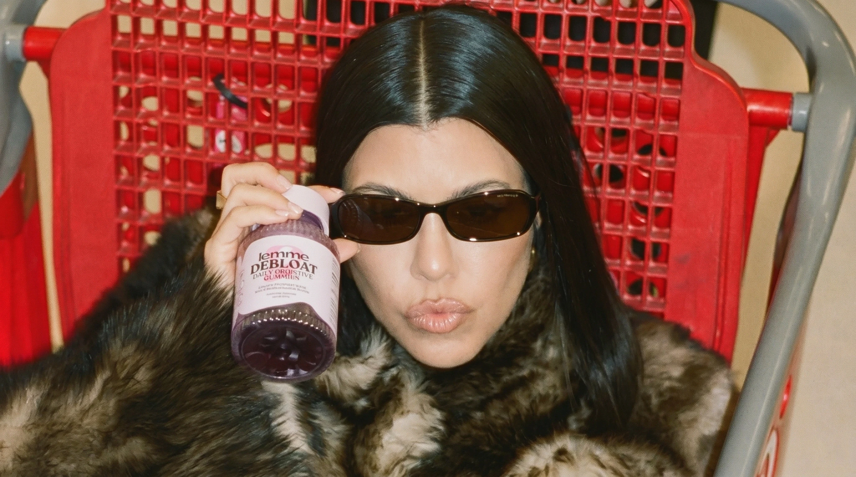
The packagings of Nutrafol, Moon Juice, and Lemme speak different languages
Seven Rules of the Nutricosmetics Visual Language
Brand styles differ, but the rules underneath are shared. Here are seven moves nutricosmetics uses to set itself apart from the rest of the supplement aisle.
1. The jar is an interior object. A pharmacy bottle gets hidden in a cabinet; a beauty jar is put on display. Hence glass instead of white plastic, weight, matte caps, refill systems with vessels too good to throw away.
2. Color works for mood. Pharma uses color as signage: white background, green cross, red flashes. Nutricosmetics borrowed color from cosmetics and fashion, and its spectrum is wide: powdery skin tones at Equi London, Feel's multicolored tubes in the spirit of runway color-blocking, deep black at SAKARA. One thing in common: here color creates a brand's mood and character, like perfume or lipstick — it doesn't encode symptoms and dosage strength.
3. Luxury typography, not dosage. On a pharmacy box, the biggest thing is “1000 mg” and the capsule count. On a beauty jar, the biggest thing is the brand name, set in a typeface that could sit on a perfume bottle. The numbers often retreat to the back of the pack.
4. Skincare vocabulary. The words on the front aren't about composition but effect and ritual: glow, radiance, ritual, elixir. The Nue Co calls its hair complex Growth Phase, Act+Acre speaks the language of a trichologist-cosmetologist, Moon Juice sells Beauty Dust. Compare that with the pharmacy's “vitamin-mineral complex No. 30” — literally different languages.
5. The form factor of food and skincare, not medicine. A pile of pills is an image of illness. So the category loves powders you whisk like matcha, shots you drink like espresso, jellies and gummies you treat yourself to instead of dessert.
6. Photo style: textures, not “before/after.” Pharma proves results by comparing photographs. Beauty shows process: a drop, a hand, morning light, powder in the air, a jar on marble. “Before/after” is near-taboo in premium nutricosmetics — it drags the product back into the category of treatment, and nobody's keen to Instagram treatment.
7. The counter-rule: science as seasoning. You can't do entirely without science — a product promising results months away needs something to support faith (and keep the customer on a subscription). So the best brands dose out pharma codes: active percentages in brand graphics, a clinical study badge, the word clinically in small type. Ritual built its brand on this: the transparent capsule as a metaphor for transparent composition, quoted by half the category since. Nutrafol went for differentiation instead: its thing is “scientific boredom” — and that, too, is a design decision, not the absence of one.
An important caveat: these rules are not a checklist. Each is an answer to the question of where the product will meet its buyer: on a shelf next to a serum, in a feed between skincare bloggers, on a bathroom counter. A brand's strength isn't in following all seven — it's in consciously choosing which to follow and which to break. How the best do it — let's look at the cases.
14 Nutricosmetics Brands With the Best Packaging Design
A quick tour of the brands we at SIRKA consider the best in the category.
Vida Glow. Australian supplements that look like makeup: matte glass, juicy colors across the range, dopamine sachets. Only the jar's shape still says “supplement” — and that's a win: the link to the niche remains, everything else already belongs to beauty.
Vida Glow: frosted glass jars and colored sachets
The Nue Co. Launched in 2016 as a DTC brand, it rebranded with studio Made Thought ahead of its retail debut — to sit naturally on the beauty shelf. At its core is the motif of an amber apothecary jar, but with more fashion to the geometry: strict lines, clean typography. The emerald metal cap with delicate embossing is the packaging's crown jewel. The pharmacy, retold in the language of a fashion magazine.
The Nue Co — beauty supplement packaging: amber apothecary glass with an emerald metal cap
Act+Acre. Trichologist Helen Reavey's New York brand started in 2019 with a single scalp detox oil and a simple idea: treat your scalp as gently as your face. When the range grew to hair capsules, the supplement naturally inherited the brand's established codes — spa minimalism, air, water, and stone. Today it stands in one row with the scalp care and is visually indistinguishable from it.
Act+Acre — hair capsules in spa minimalism next to scalp care
Feel. A British DTC brand whose packaging studio Lyon & Lyon built on minimalism and bold color. The front of the boxes and tubes is nearly empty — a logo and a couple of lines — while each product is coded with its own saturated hue: packaging you want on display, and it won't let you forget your daily dose. The glossy sachets are a pleasure to carry in a handbag — the most Instagrammable part of the system. And behind the beauty stands consistent ecology: tubes and boxes of dense recyclable cardboard, compostable pouches and sachets made of cellulose and biodegradable polymers, even the printing done with plant-based inks.
The minimalist packaging of Feel supplements: a matte box and glossy sachets
Augustinus Bader. Luxury skincare, and the classic case of supplements inheriting a ready-made brand rather than building their own: as with Act+Acre, the supplements came after the main line and adopted its codes wholesale. The cobalt blue glass of the legendary $300 The Cream, the copper cap with engraving, the gold AB monogram — all carried over to the capsule jar without a single concession to “vitamin” aesthetics. The only reminder that there's a supplement inside is the line Daily Dietary Supplement in small print — beauty from within sold simply as one more format of skincare.
Augustinus Bader — cobalt blue beauty supplement jar with a copper cap
The Beauty Chef. An Australian inner beauty classic grown from founder Carla Oates's idea that “beauty begins in the belly.” The packaging plays on the contrast of two worlds: the logo comes from the grocer's — a round stamp-emblem with a cooking pot, like a mark on a craft product — while the jars themselves are pure beauty: powdery pink, matte, with neat small typography, the kind you shelve next to creams, not spices.
The Beauty Chef — powdery pink Glow supplement jars with a stamp emblem
WelleCo. Elle Macpherson's brand, whose key identity asset is the weighty faceted glass jar of The Super Elixir with its domed cap — closer in heft and form to luxury skincare than to a powder canister. The jar became so iconic its image moved onto the plastic jars and refill pouches: the silhouette is printed right on the packaging, and the product is recognized instantly.
WelleCo — the iconic faceted jar of The Super Elixir and refill packaging
Wellbel. Minimalist wide squat jars in complex muted colors — sage, cream, cocoa, black — that read as skincare on a bathroom shelf. Every question a buyer might have is answered on the front: what it is, what it's for, who it's for, how much to take, how long it lasts. The brand started with supplements, and when hair care came later, it simply inherited the ready-made codes — Act+Acre in reverse.
Wellbel — minimalist hair, skin and nails supplement jars in muted colors
SAKARA. The brand launched in 2012 as plant-based meal delivery with the ambition of being “the first fashion-forward food brand”: studio VMG Creative deliberately went against the pastel health food category — deep saturated colors and the rule that every creative should look like a page torn from Vogue. When supplements arrived in 2021, they inherited a ready-made fashion system, and today it's one of the most “cosmetic” packages in the category: uncompromising black, green, and red, glossy black bottles and jars with an embossed monogram on the caps, elegant typography with product names straight off a perfume label — Daily Elixir, Night Service. Almost nothing here says “supplement,” and that's the whole point.
SAKARA — black supplement bottles and jars with an embossed monogram
Vegamour. A hair wellness brand that started in 2016 with cosmetics: first a lash serum, then hair care, and only later supplements in the range. The supplements got the “parent” identity: dusty rose, a thin serif with wide letterspacing like the perfume houses use, gold foil and delicate botanical line art on the boxes. The premium Ageless line takes the idea to its limit: mirror-gold bottles, already pure anti-aging-luxe territory.
Vegamour — dusty rose hair supplement packaging with gold foil
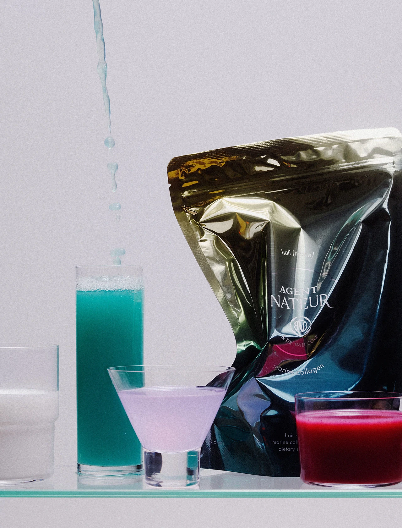
Agent Nateur. Another brand that came to supplements from cosmetics: Jena Covello launched it in 2015 with a luxury natural deodorant, and the collagen holi (mane) arrived in 2020, inheriting the established French perfume code — a figured cartouche emblem, graceful serif type, product names in lowercase with parentheses. The photo style completes the idea: the powder is stirred not in a shaker but in a cocktail glass with a cherry — beauty as an aperitif.
Agent Nateur packaging in an elegant setting
Aime. A Parisian brand whose name is a confession: French aime means “loves,” “love,” “likes.” The supplements here are conceived and presented in a “beauty from within” philosophy. Aime adopted the skin-tone palette before Skims made the nude gamut a fashion dogma: the collagen sticks run from ivory and nude to mocha and dark chocolate, like a line of foundations. A special delight is the silver clutch-case for capsules with an embossed logo: a chic accessory you wouldn't be embarrassed to produce at a restaurant table.
Aime — collagen sticks in a nude palette and a silver pillbox clutch
Depuravita. An Italian brand at the junction of Ayurveda and European herbalism: small batches, made in Italy, and a principled stance — “not a trend but a long view of beauty.” The packaging is a creamy palette with gold and a signature engraved rising-sun motif, elegant serif capitals. The refinement is balanced by a witty verbal layer — the products are called Hello Wrinkles, Let Go, Strike a Pause.
Depuravita — cream and gold supplement packaging with a rising sun motif
Perla Helsa. A Ukrainian beauty and wellness supplement brand whose identity was created in 2021 by Kyiv agency Orchidea. One of the first supplement brands built from scratch by the laws of the cosmetics category. The central pearl image reflects the naming, while the soft gradients of the packaging nod to mother-of-pearl. The typography is borrowed from skincare too: a supple serif logo paired with a neat grotesque, like on serum bottles. Translucent pearlescent jars show off the capsules themselves — colorful and appetizing, like dragées. The photo style completes the system: studio light, glossy surfaces, colored backdrops and birds-of-paradise in the frame — a shoot on the level of a cosmetics campaign, not a supplement catalog.
Perla Helsa — beauty supplement packaging with gradients and a pearl image
SIRKA Case Study: Rebranding Supplement Brand NutraHarmony
Here's how these rules work in a real project — our rebrand of NutraHarmony. The task: premiumization while keeping the brand recognizable. Three constants served as anchors: black as the primary color, a rich accent color, the brand symbol, and everything else was reassembled by the rules of the category. The metal cap with embossing turns the jar into an object you want to keep in sight, a serif with an italic subhead labels the product like a perfume, the benefits retreated into three lines of small gold type. The result is a jar you're not embarrassed to set next to a two-hundred-dollar cream — and can't mistake for anyone else's.
NutraHarmony after the SIRKA rebrand — a black supplement jar with a metal cap and gold typography
Nutricosmetics Design Trends — and a 5-Question Checklist
The category's language keeps changing. Pastel minimalism was the synonym for a pretty supplement for a decade, and it's worn thin. So the pendulum has swung back toward science: percentages, clinical badges, and lab aesthetics are returning to packaging — but now as a conscious design device, not a pharmacy necessity. The winners are brands that find their own proportion of luxe, lab, and ritual.
If you're building a nutricosmetics brand, answer five questions before the design:
Where will the buyer meet the product? A retail shelf, a social feed, a cosmetologist's office — the channel dictates the code; that's the main lesson of the category's entire history.
Which dialect is yours? Clinical luxe, wellness ritual, pop, medicalization — pick one and speak it consistently; an unintended mix reads as noise.
Is the jar worthy of a vanity table? Or a dinner table? If the packaging isn't a shame to toss, you're still selling just a supplement.
How much science in the frame? A product with a delayed effect has to support faith — decide whether science will be the seasoning or the main course.
Which rule will you break? Everyone follows all seven — the memorable ones consciously break one.
And if you'd rather not answer these questions alone — come talk to us. SIRKA designs brands and packaging for beauty supplements: from strategy and positioning to a jar nobody will want to hide in a cabinet. Write to us — we'll show you what your formula could look like.